Tools I used
Figma, Paper sketches, Figma prototype
About the project
FoodToast is a regional food delivery service opearted in more than 500 Indian cities. It aims to improve urban consumers' quality of life and experience by providing the convenience of food ordering, delivery, and an overall experience.
The apps functionality include:
-
Order food from different restaurants
-
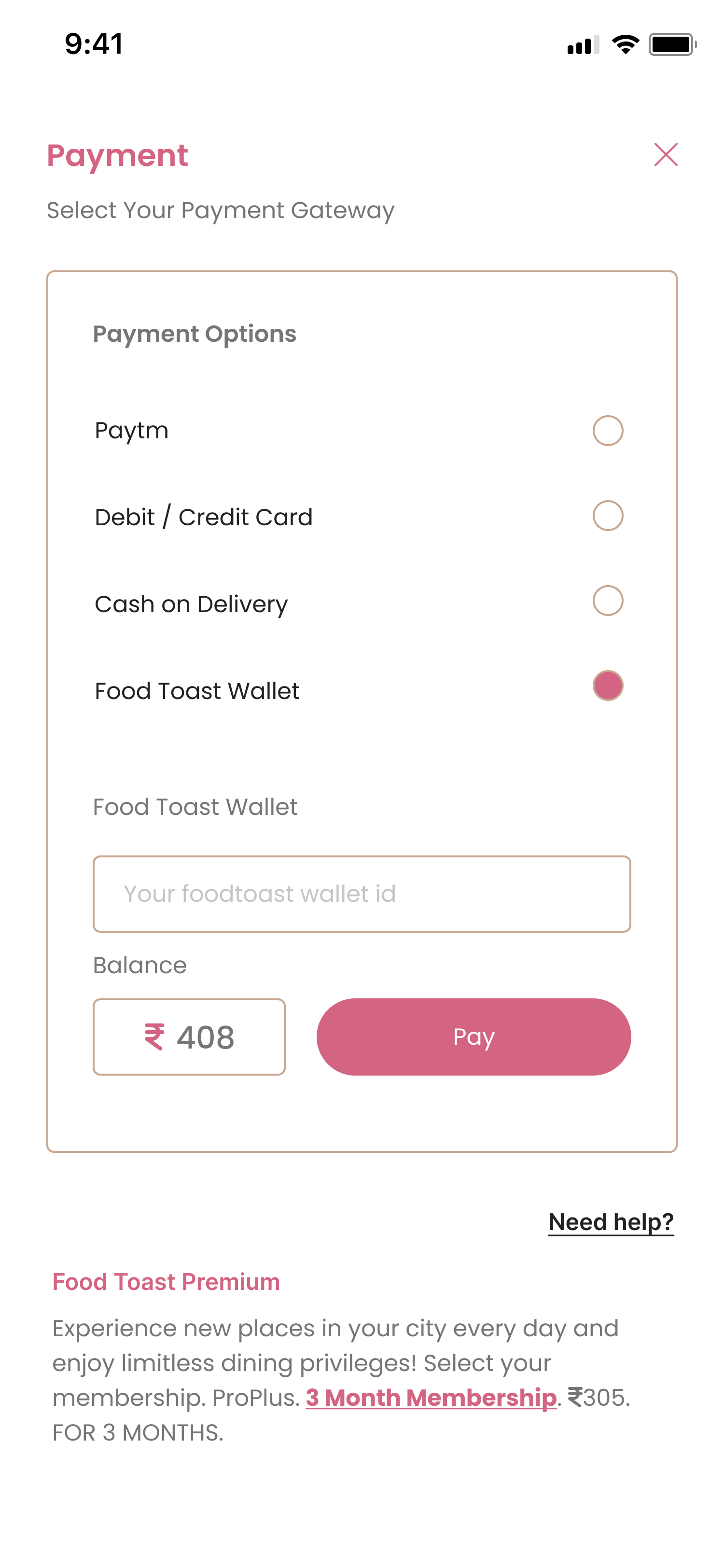
Use Foodtoast wallet for payment
-
Get notifications on orders, status and offers.
-
Order food and schedule whenever you want it to get delivered
Timeline
November 2021 - February 2022
Project type
Peer reviewed - Solo project for ![]() UX Design course
UX Design course
Area of Interest
Visual, interaction and motion design
My role and responsibilty
UX designer designing an app for Foodtoast from conception to delivery - Conducting interviews, paper and digital wireframes , low and high-fidelity prototyping, conducting usabilty studies, accounting for accessibility, iterating on designs, detemining information architecture, and responsive design.
The goal
The goal is to design an app for all food enthusiasts that allows them to easily order special and fresh food and get them delivered at any time they want it to be.
Problem
People who are busy and travel distances for work generally do not have time to prepare food or to enjoy quality food at all available circumstances
How might we create a reliable solution that helps candidates find ideal jobs and also suggests proper courses to upskill and get superior jobs.
Solution
The solution is to develop a mobile application that enables users to schedule and order meal delivery.
"The service will also keep users updated on the order status, delivery progress, and other activities within the app."
Pain points
-
Time
It's challenging for working folks to make lunch on time.
-
Accessibility
There is a lack of accessibility and clarity in mobile apps for placing food orders.
-
Usability
It is necessary to enhance user flow when using the app to complete a specific job.
User Research
Users want a mobile app that enables them to place online food orders and set delivery times./p>
Summary
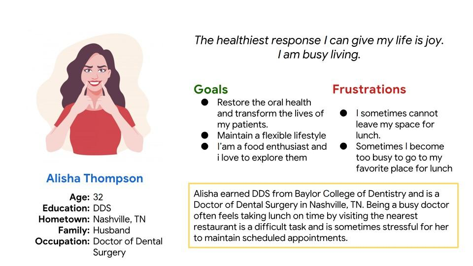
I conducted interviews, created empathy maps to understand the users and, designed for their needs. A primary user group identified through research was working adults who don’t have time to prepare food. This user group confirmed inferences about Foodtoast customers which revealed that time was not the only factor limiting users from cooking at home but, to going to restaurants as well.
User personas
User journey map
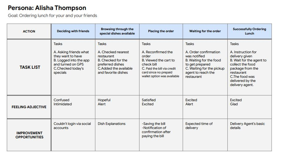
How useful it would be for consumers to have access to the Foodtoast app was highlighted by mapping Alisha's user experience.
User story board
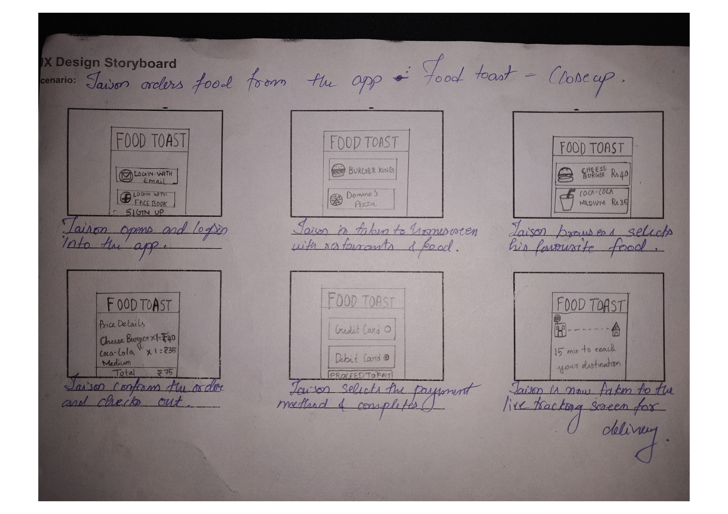
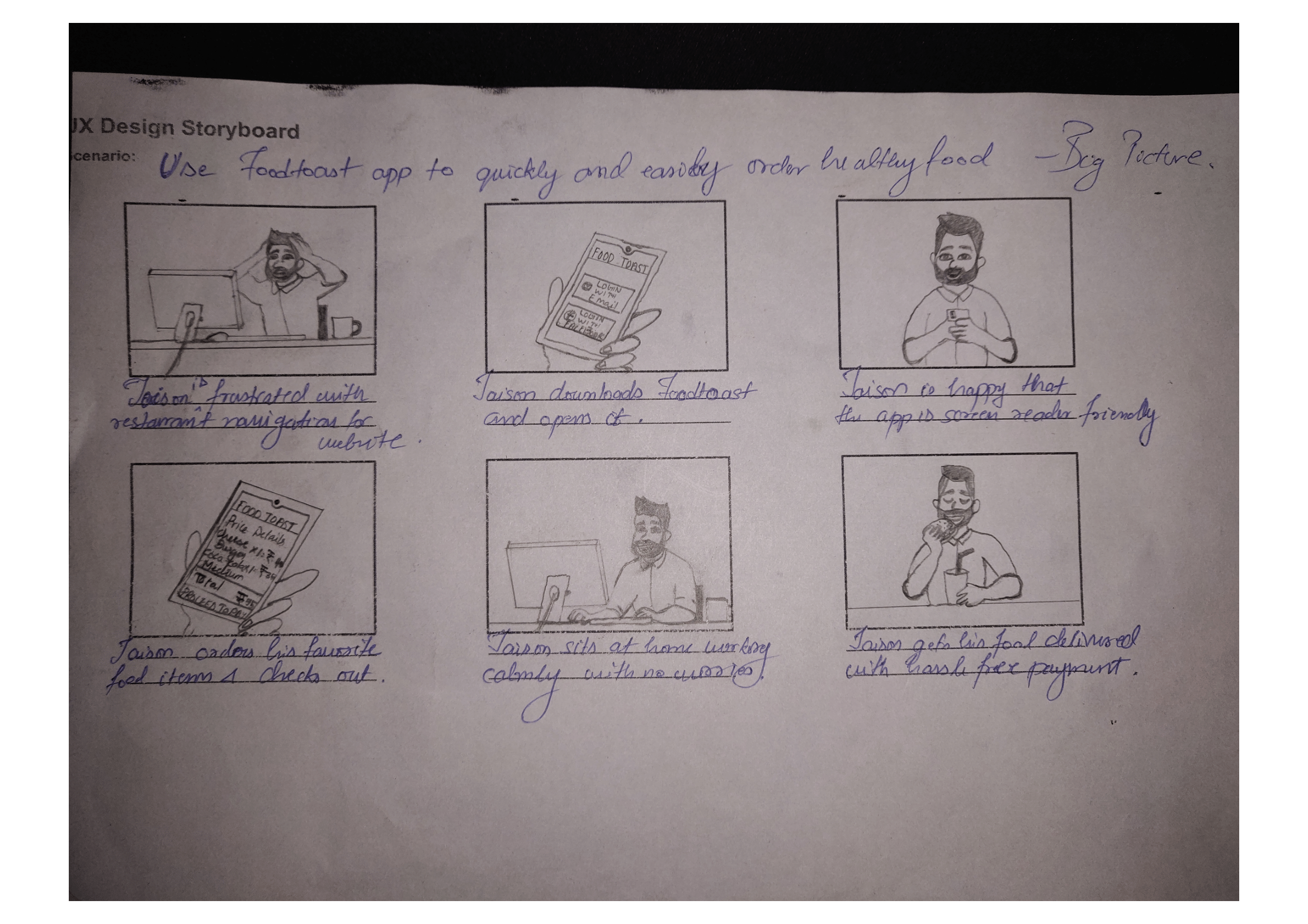
How useful it would be for consumers to have access to the Foodtoast app was highlighted by mapping Alisha's user experience.
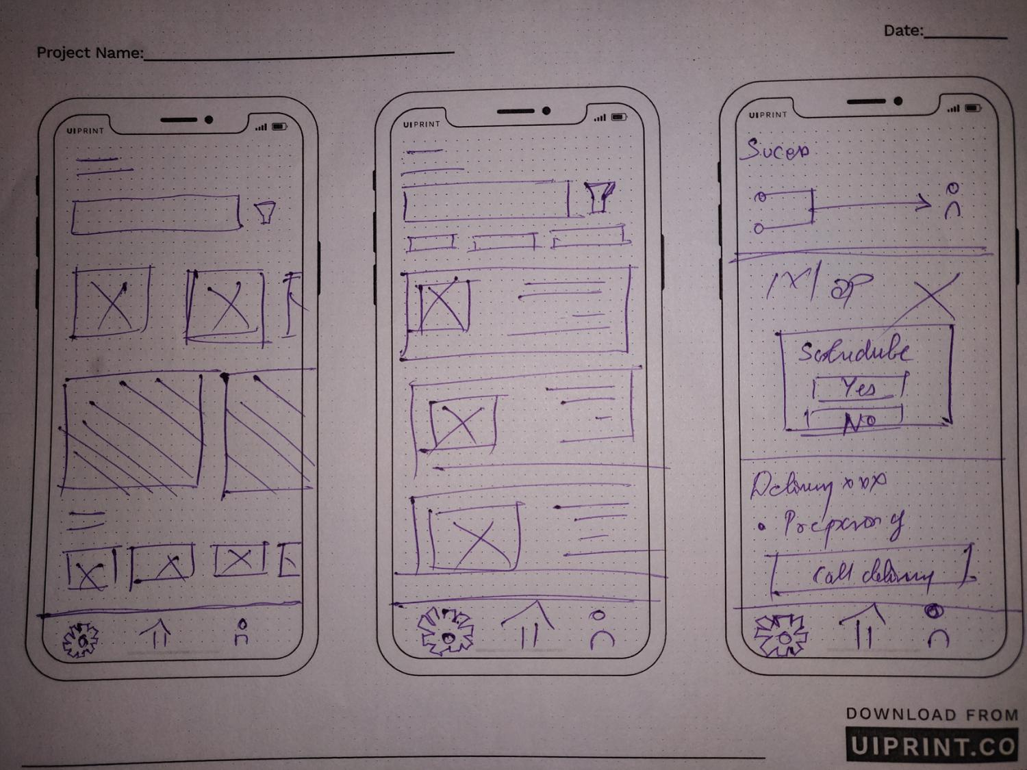
Initial paper wireframe sketches.
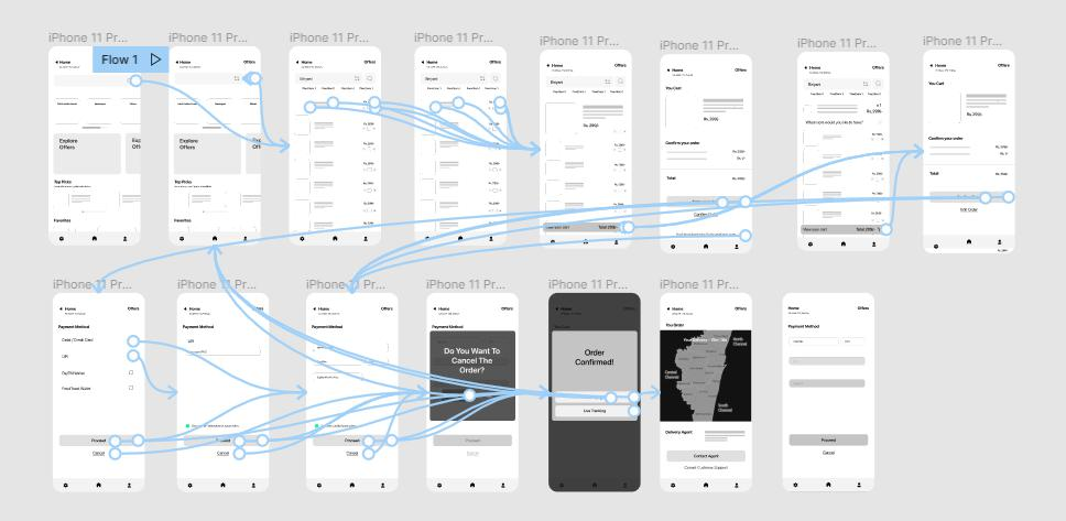
The user will arrive at the home screen, and see the top-selling & most popular meals.
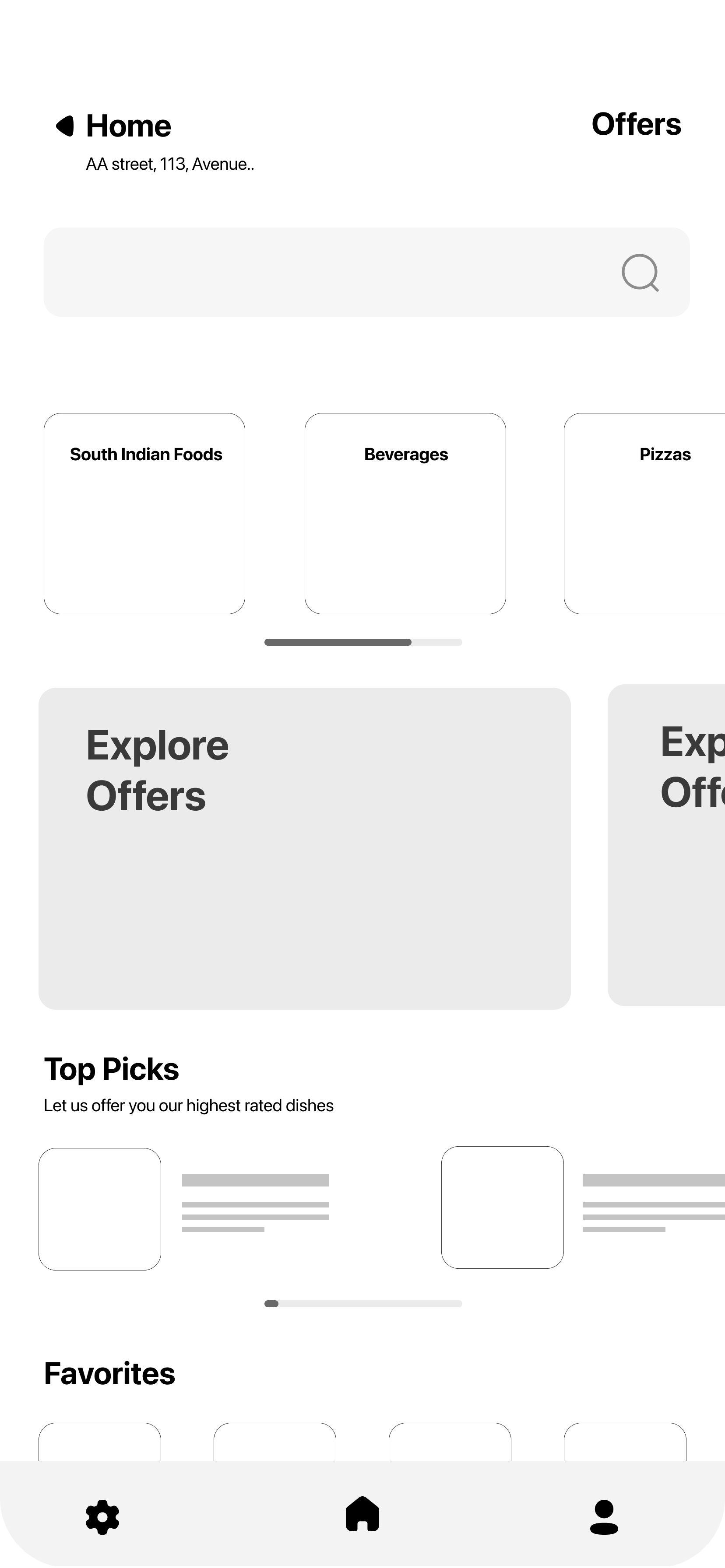
They can look up and filter out the foods they want to order.
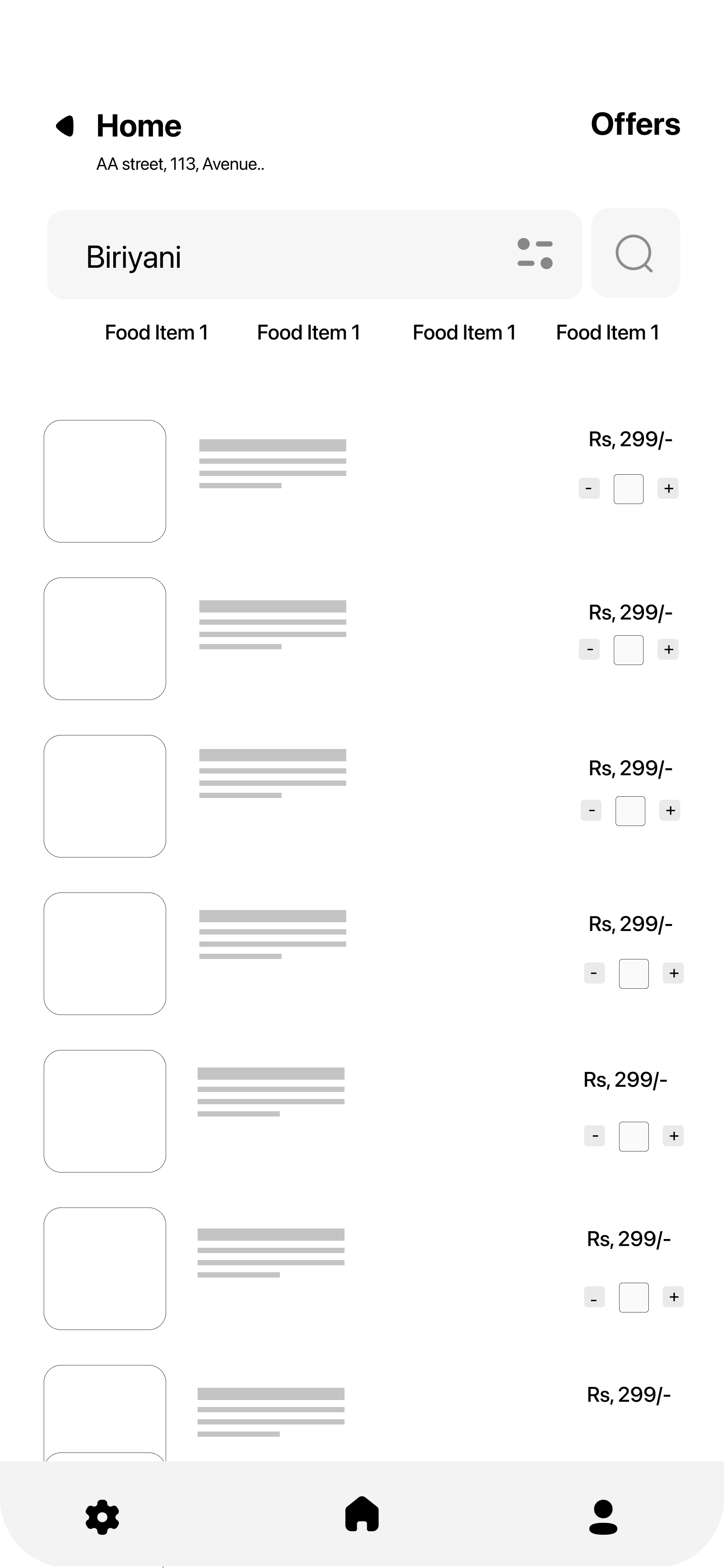
The user can now add the meals' items to their cart.
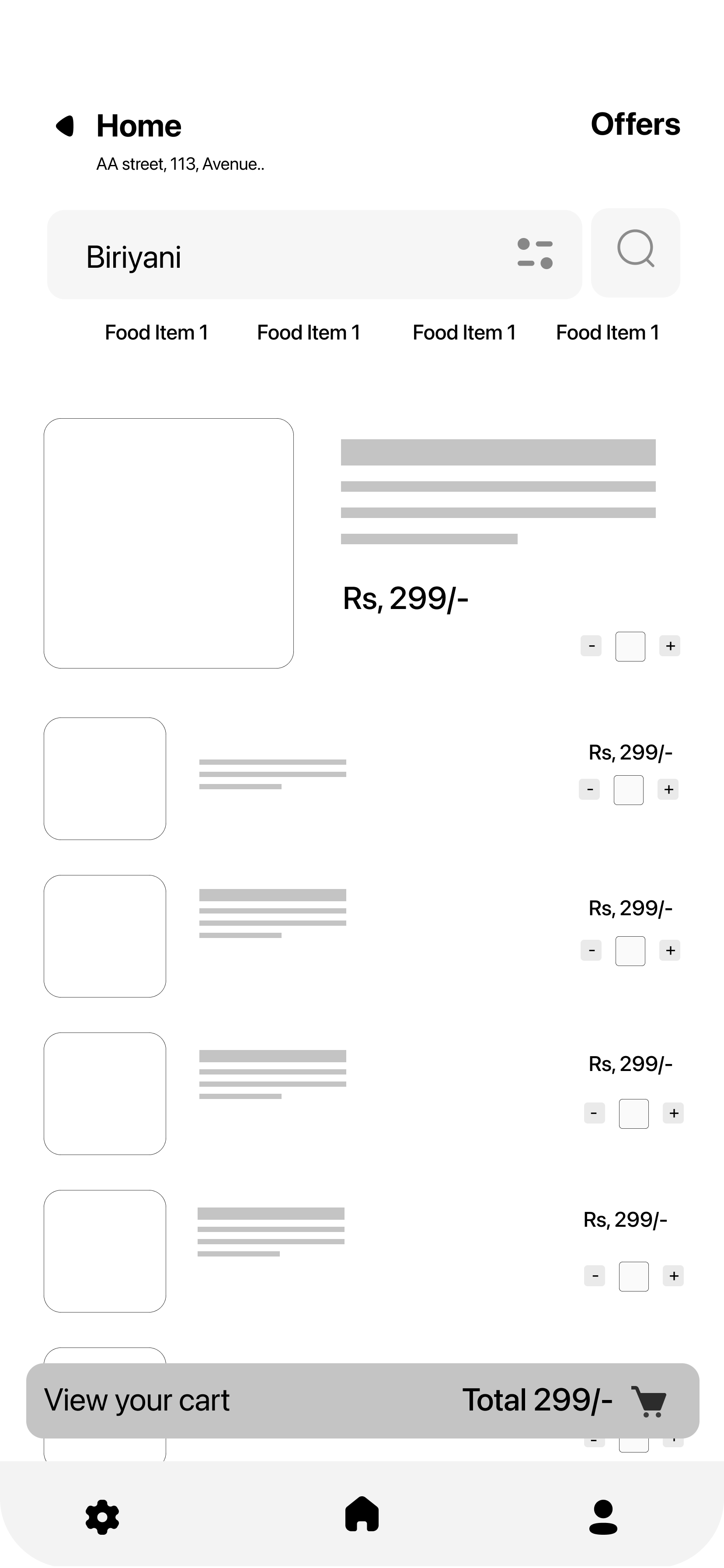
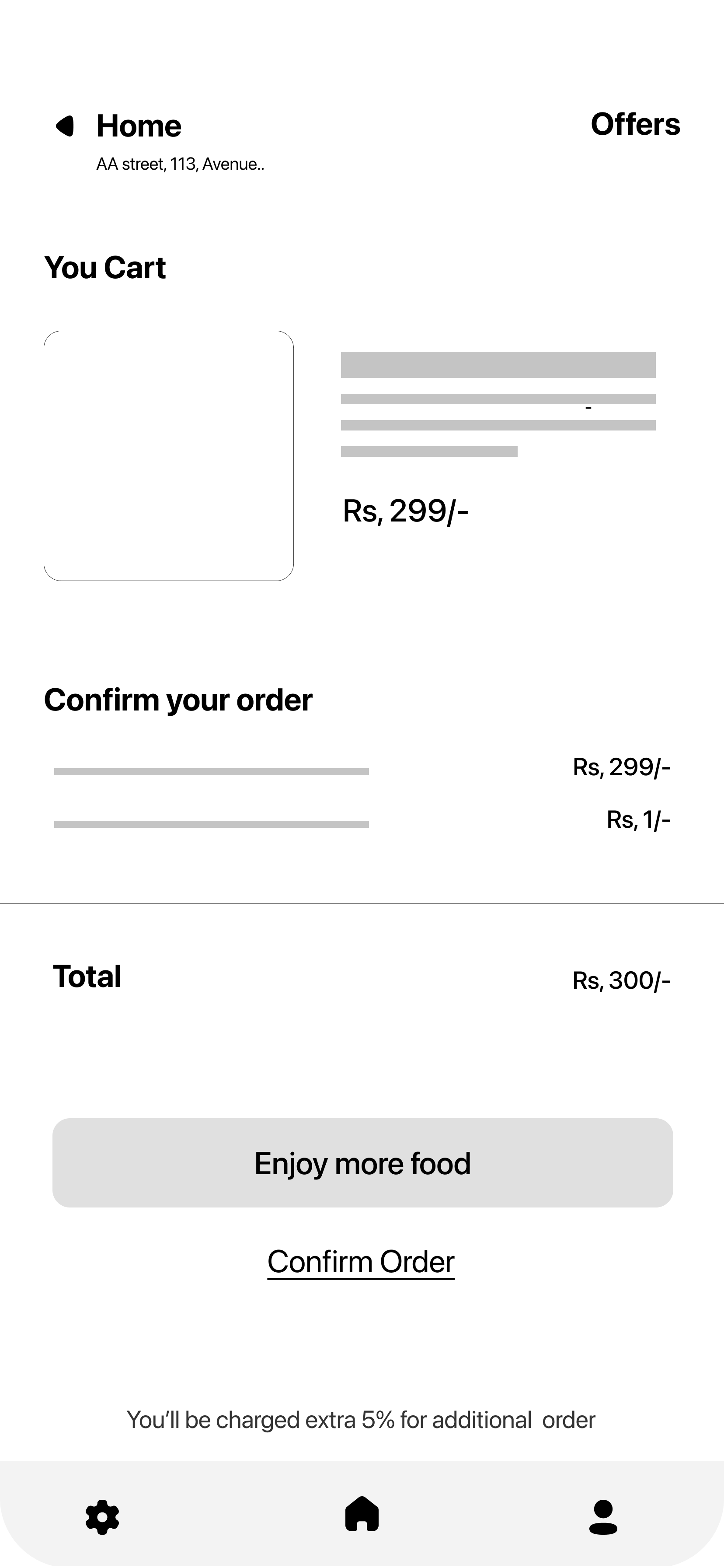
If desired, confirm your order or include more meal items.
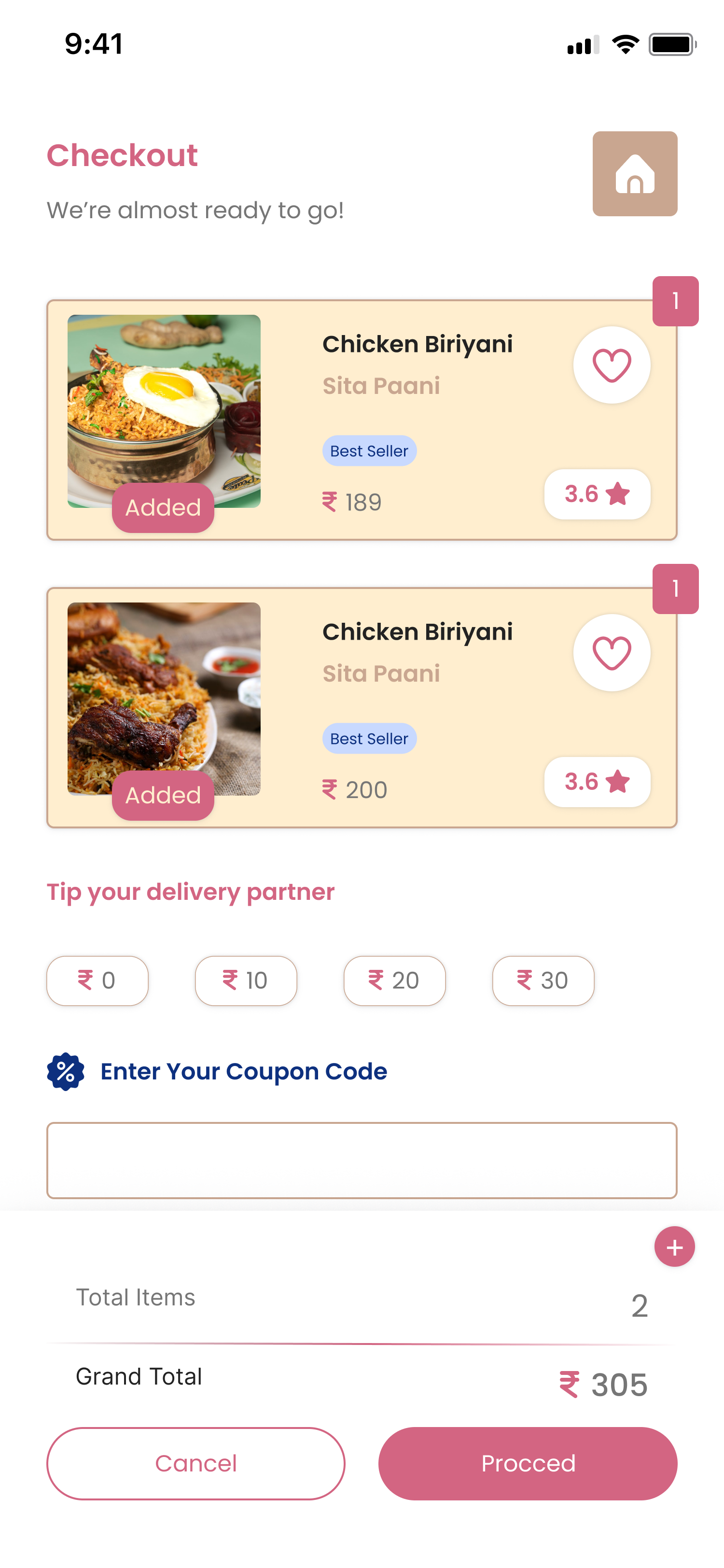
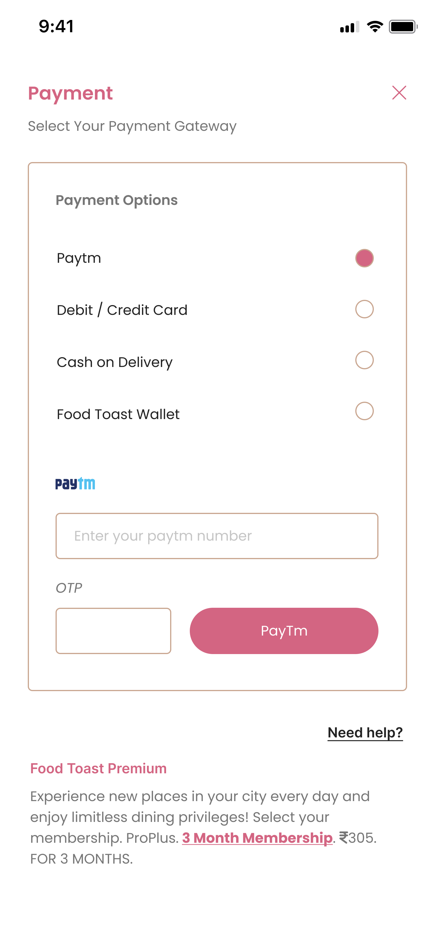
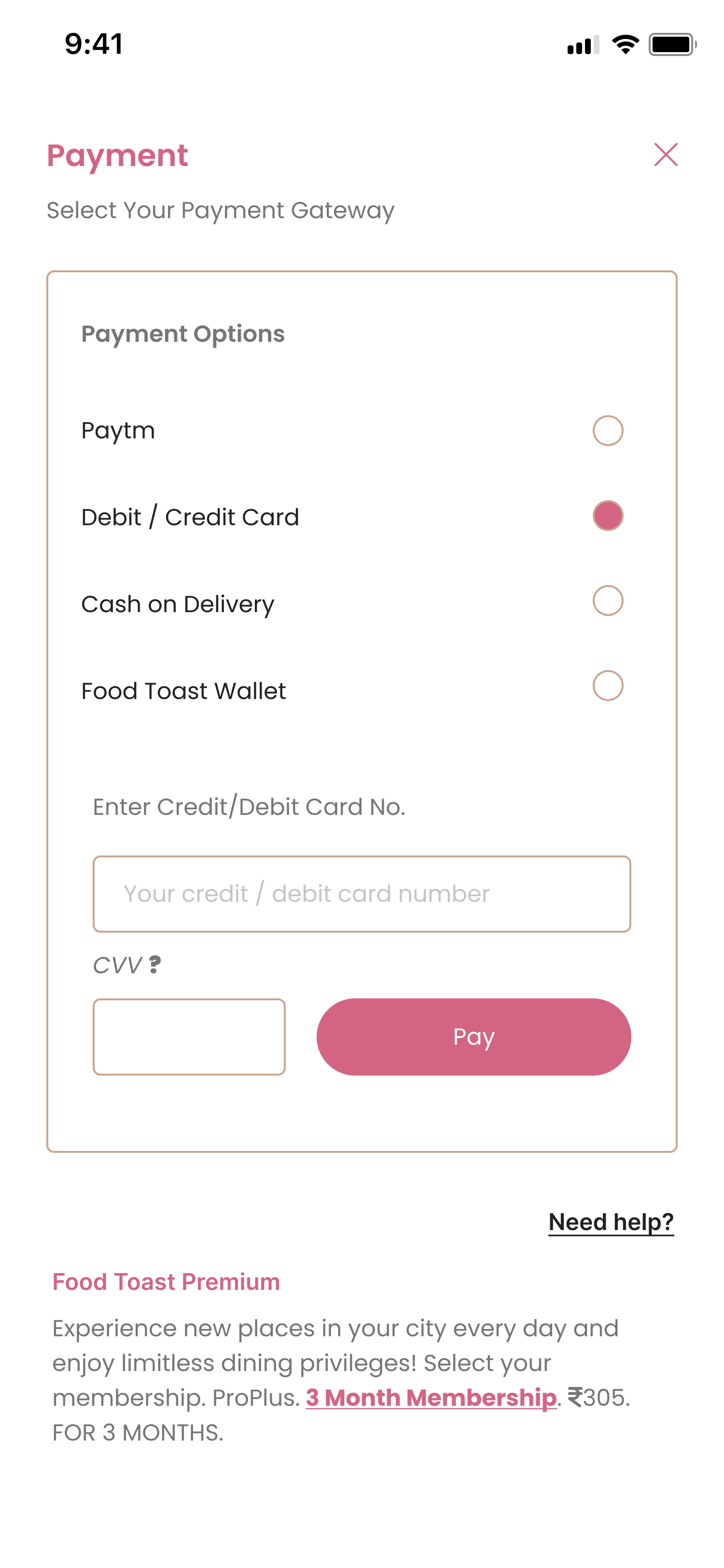
To confirm the ordered meals, select a payment option that is convenient.
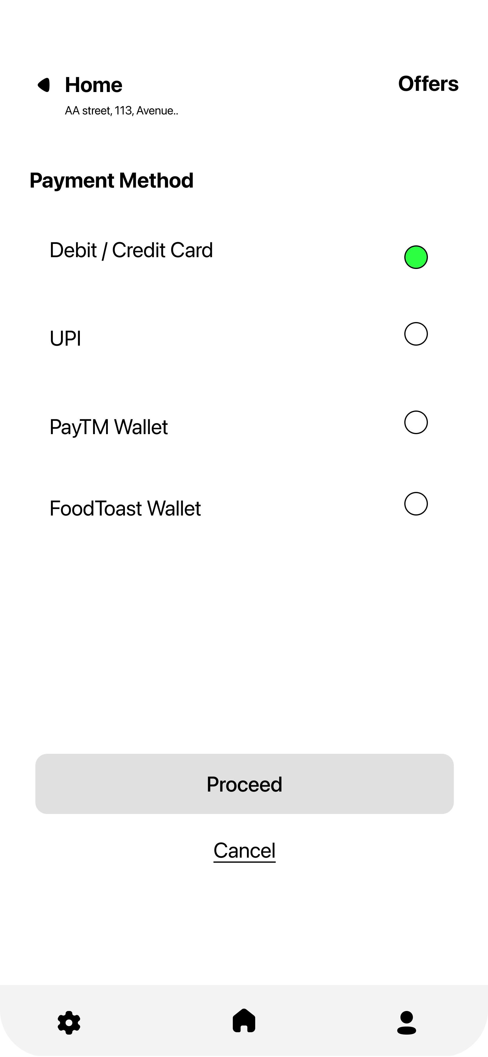
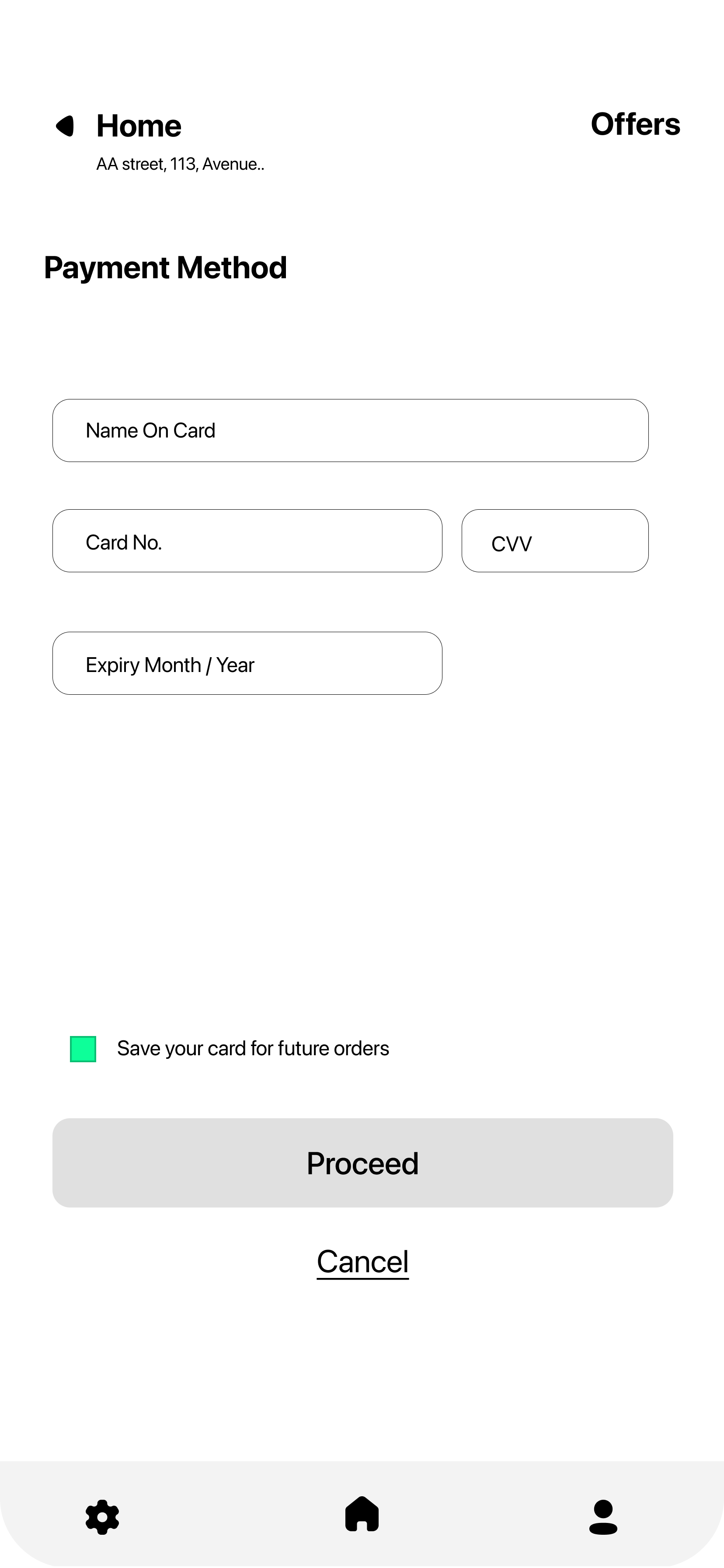
Type in the details of your payment method. The payment method can also be saved by the user for later usage.
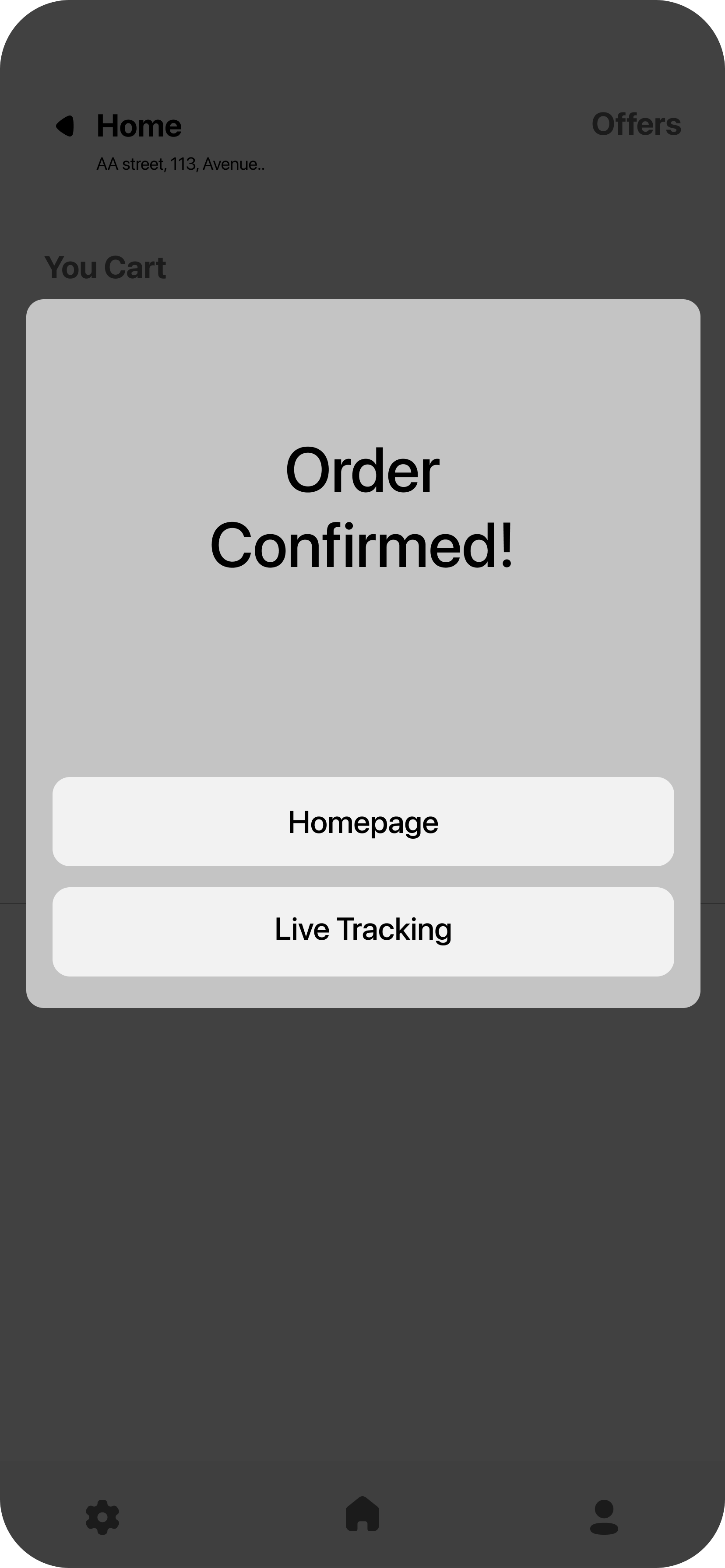
The order confirmation screen appears here.
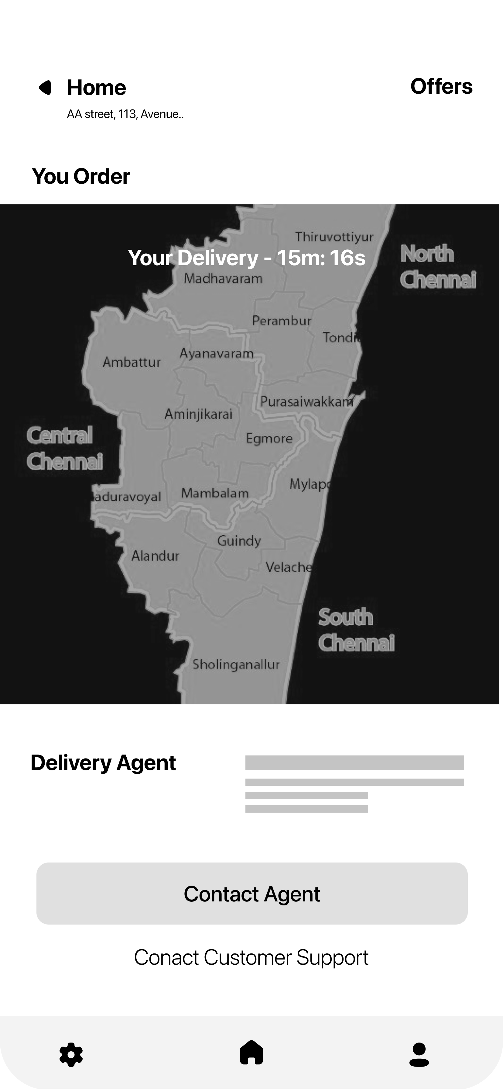
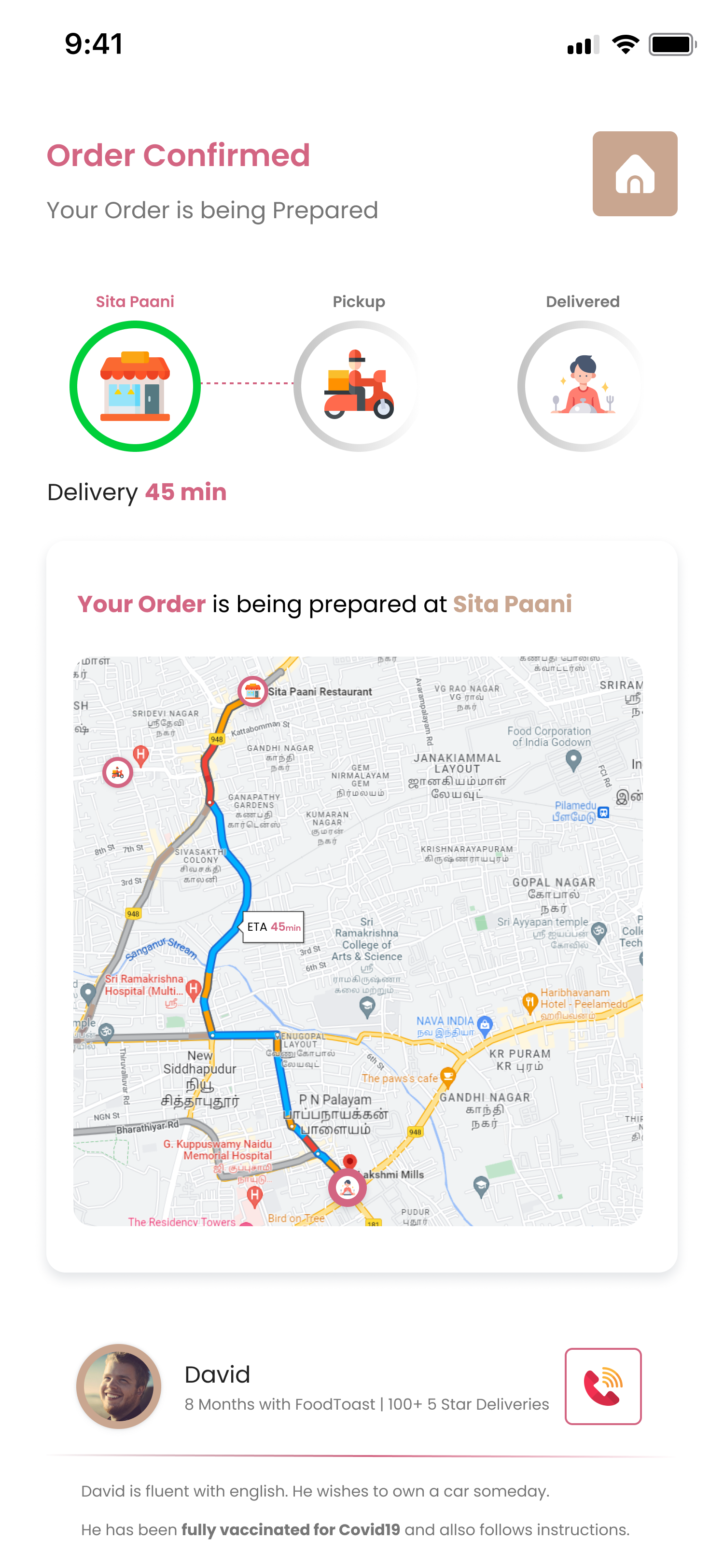
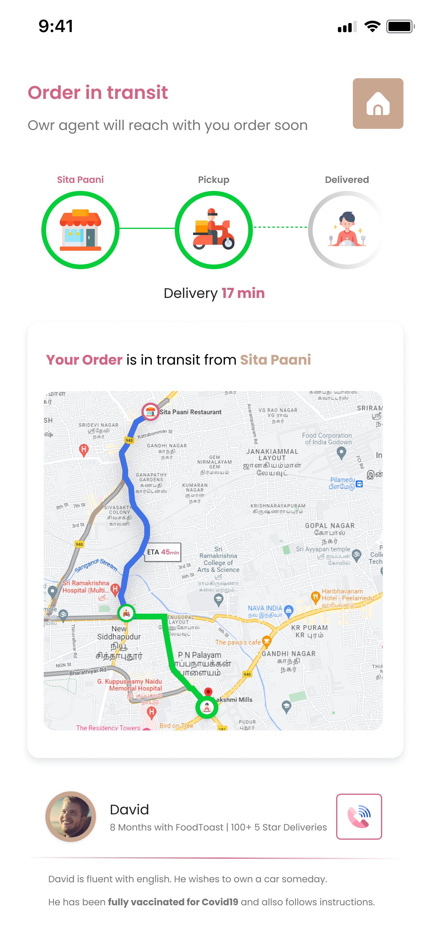
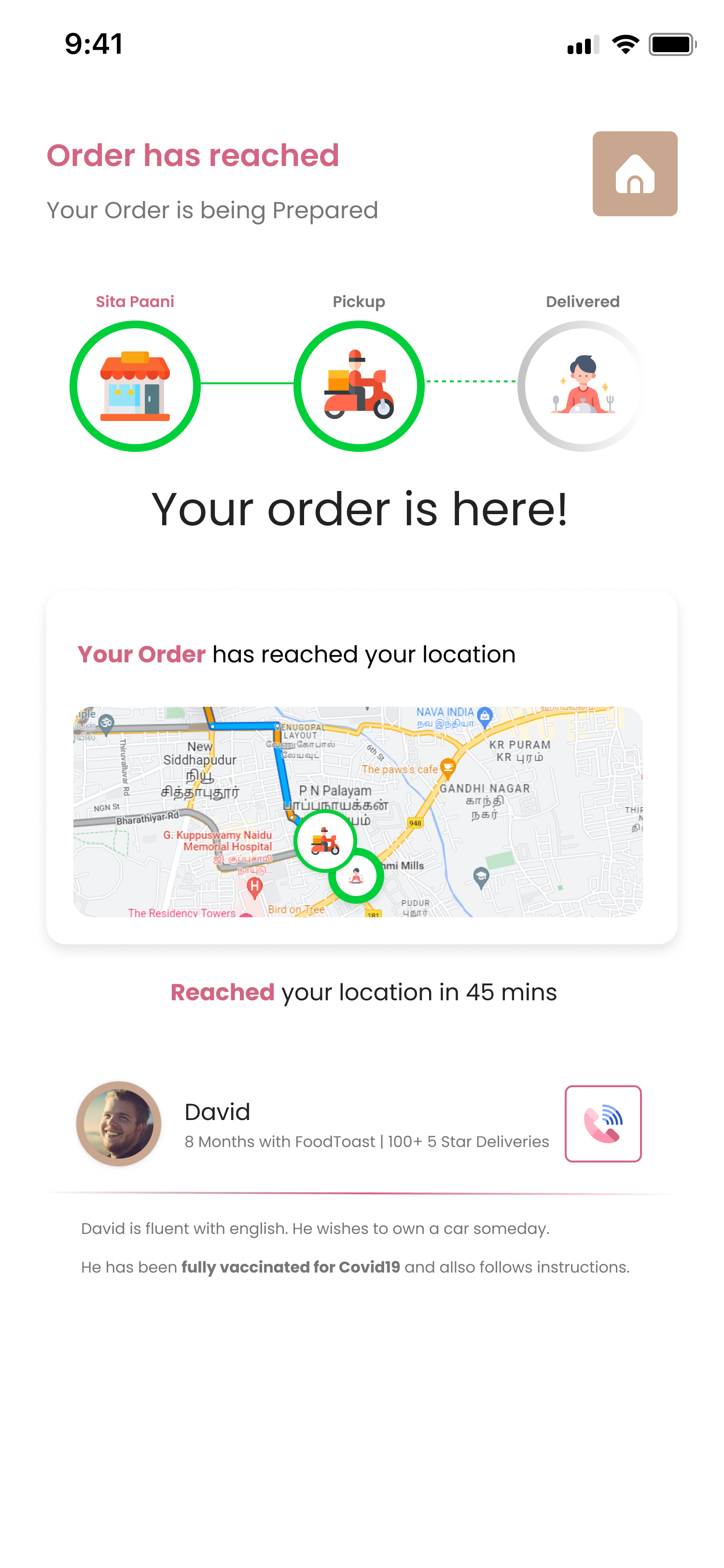
The user can keep track of both the order's and the delivery's progress in real time.
I conducted two rounds of usability studies.
-
The first study's findings were used to inform the wireframes and mockups of the designs.
-
The second research showed which elements of the mockups needed to be improved through the deployment of a high-fidelity prototype.
Round 1 findings
-
Users want to order meals with knowledge.
-
Customers wish to place food orders and eat from various restaurants.
-
Users find that scheduling their delivery time is useful.
Homescreen and the menu item search screen
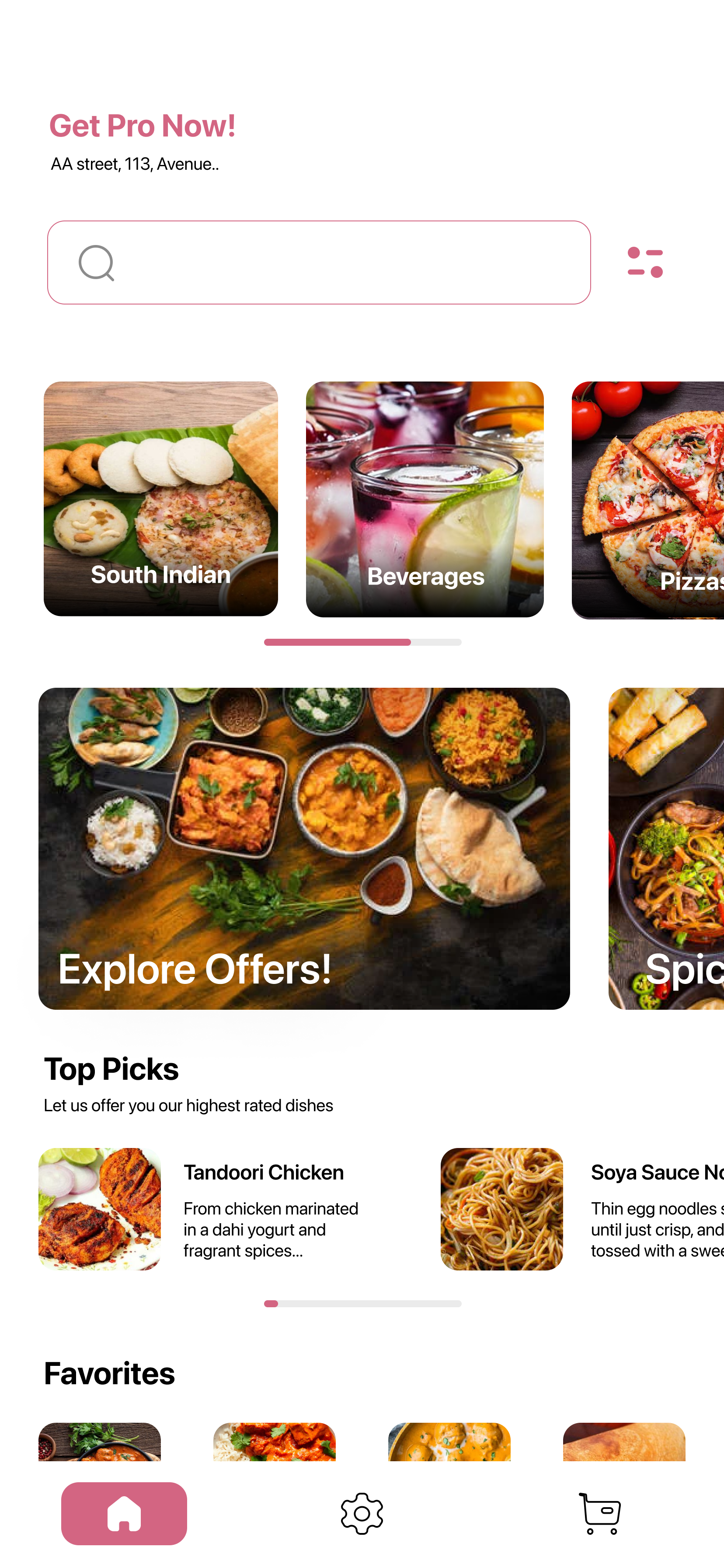
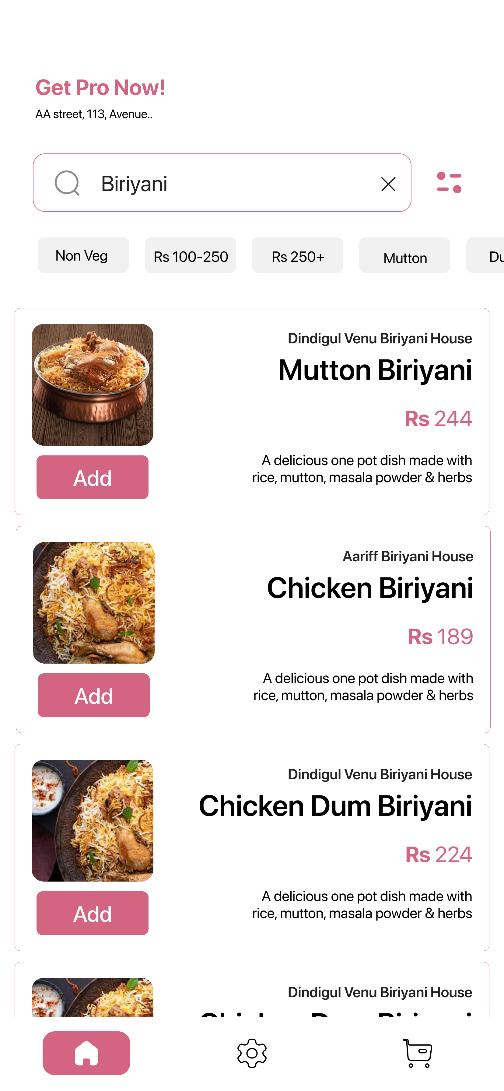
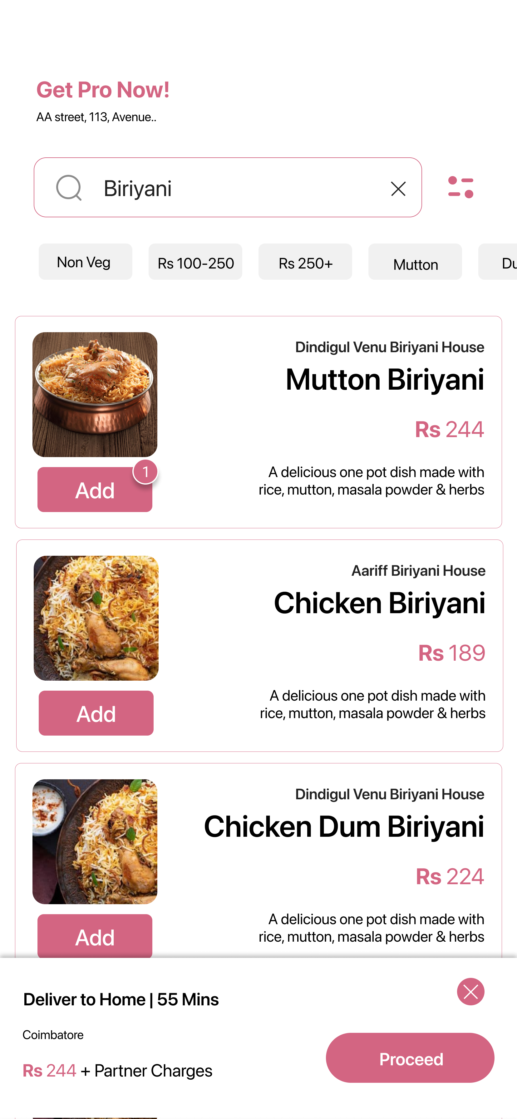
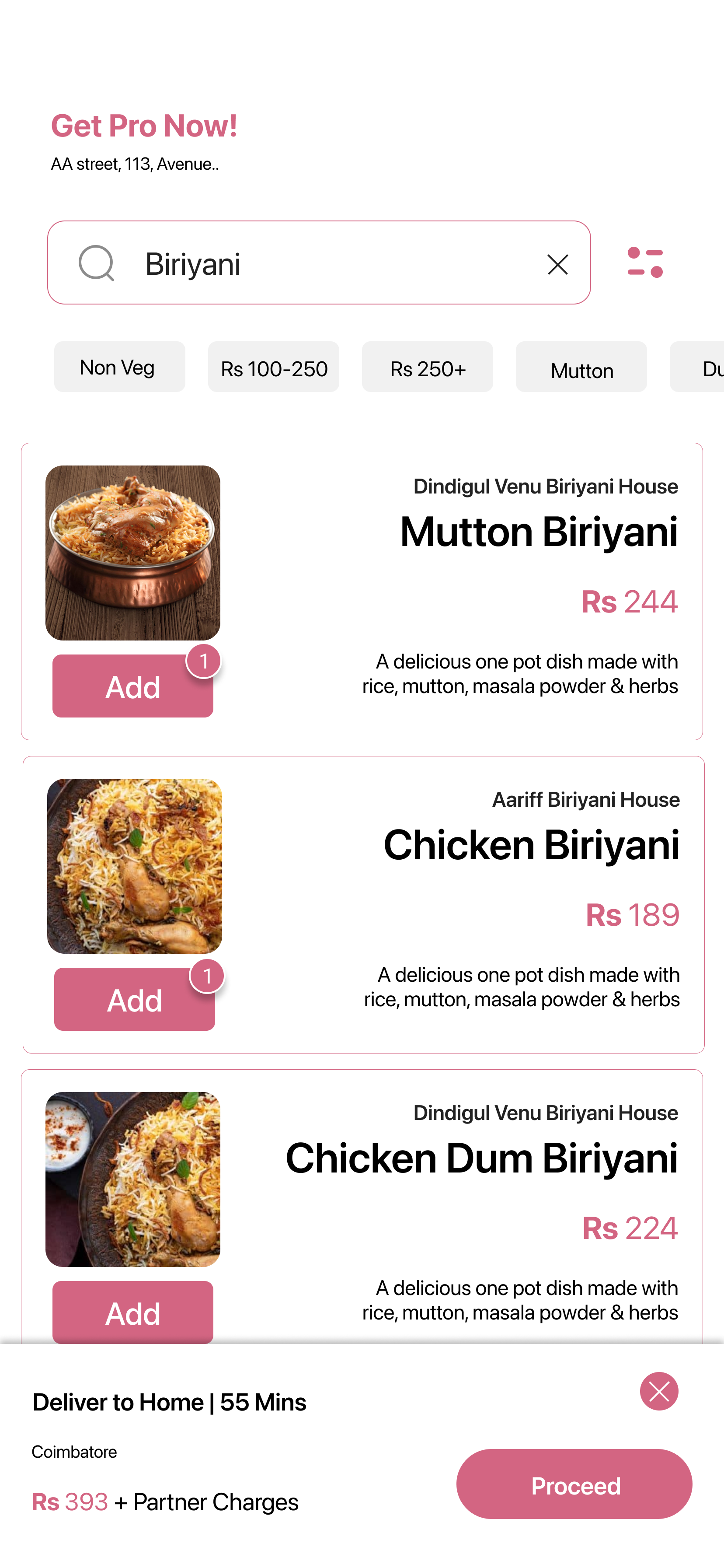
Ordering and appreciating the delivery person with tip
-1.png)
-2.png)
-3.png)
-4.png)
Selecting the most convenient payment method
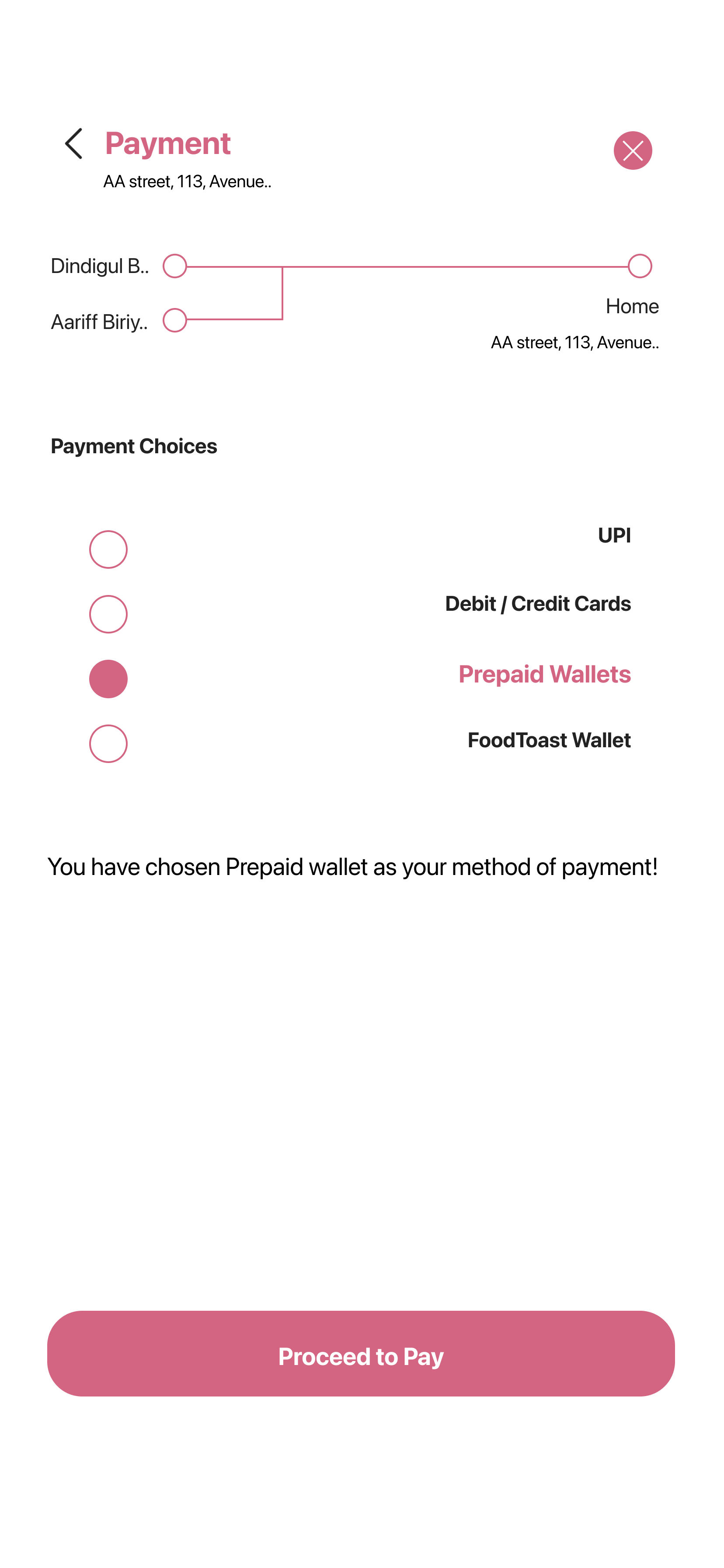
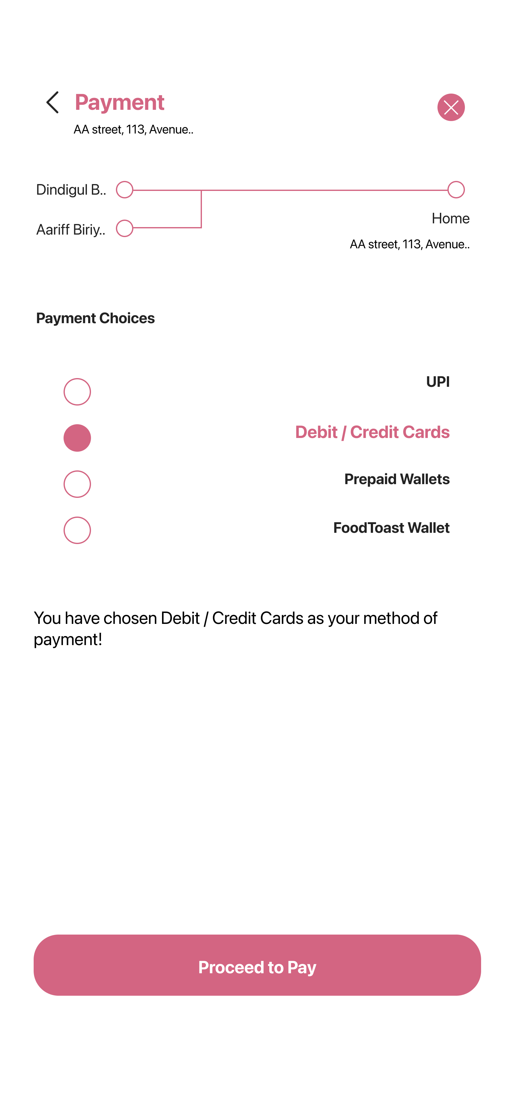
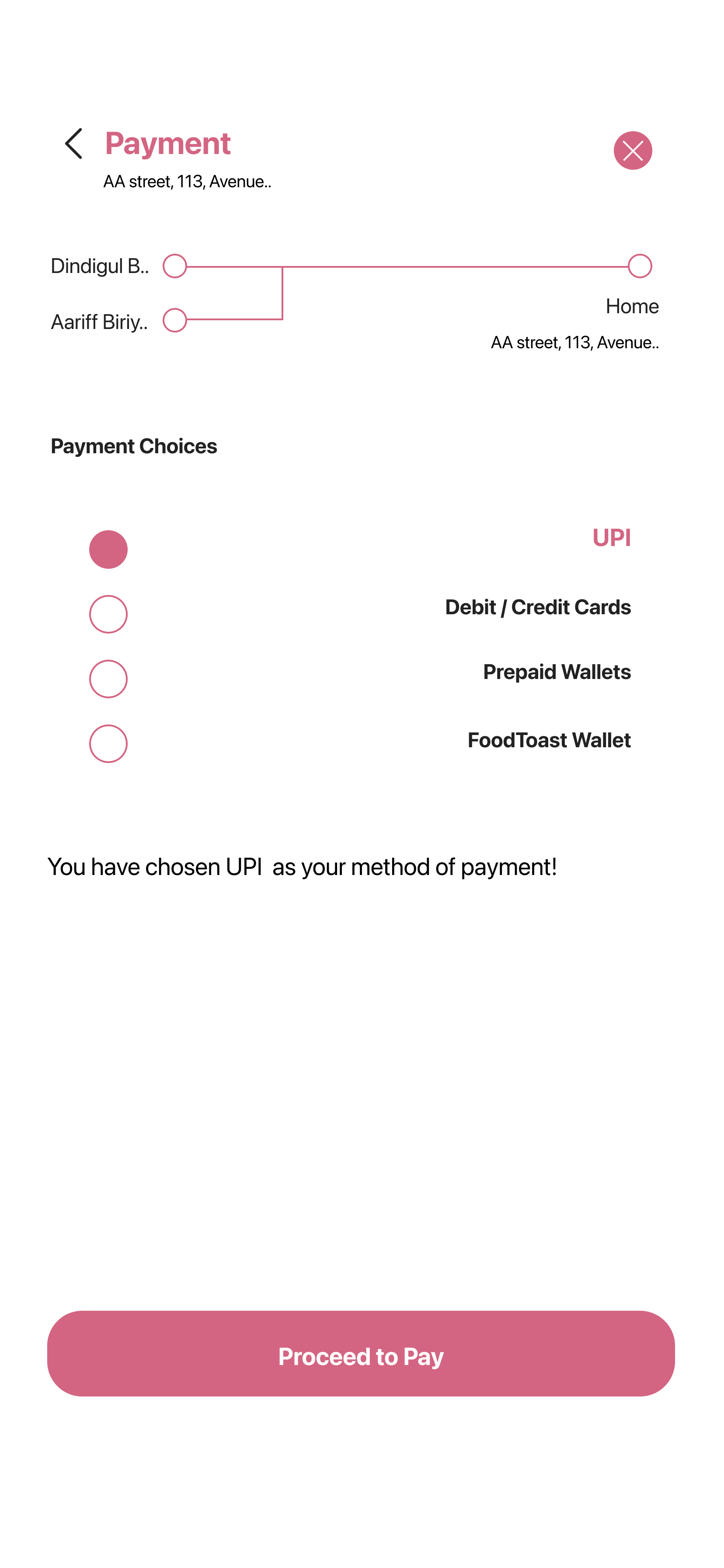
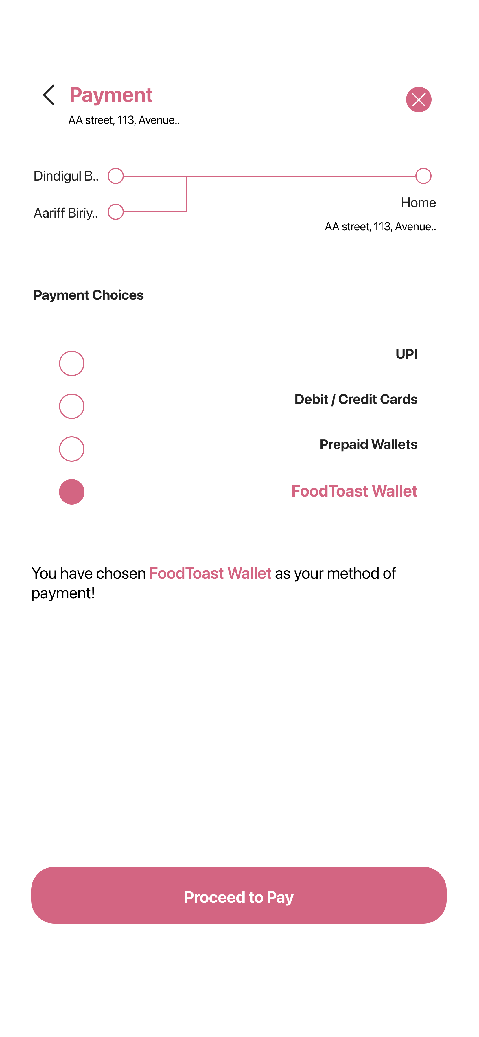
Ordering, scheduling, and tracking your meal items
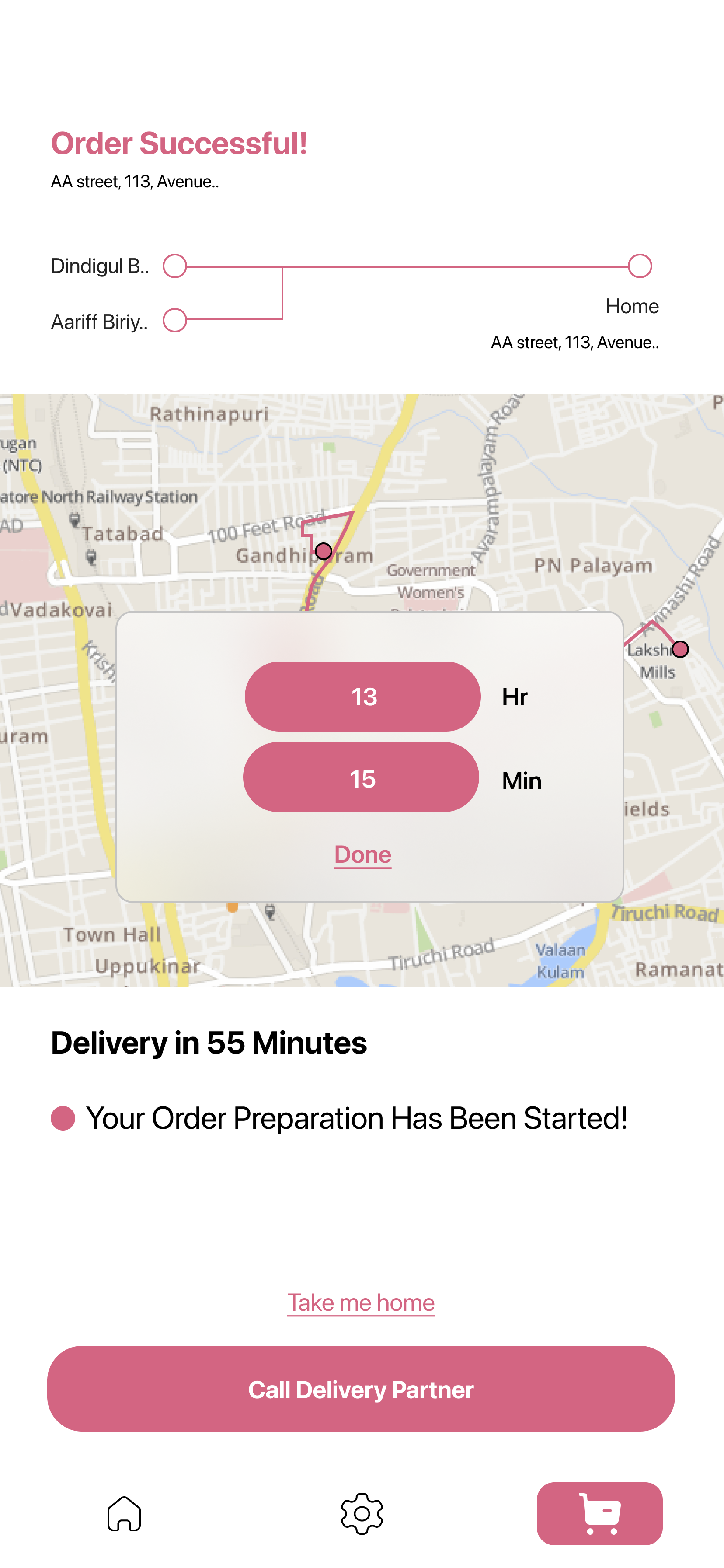
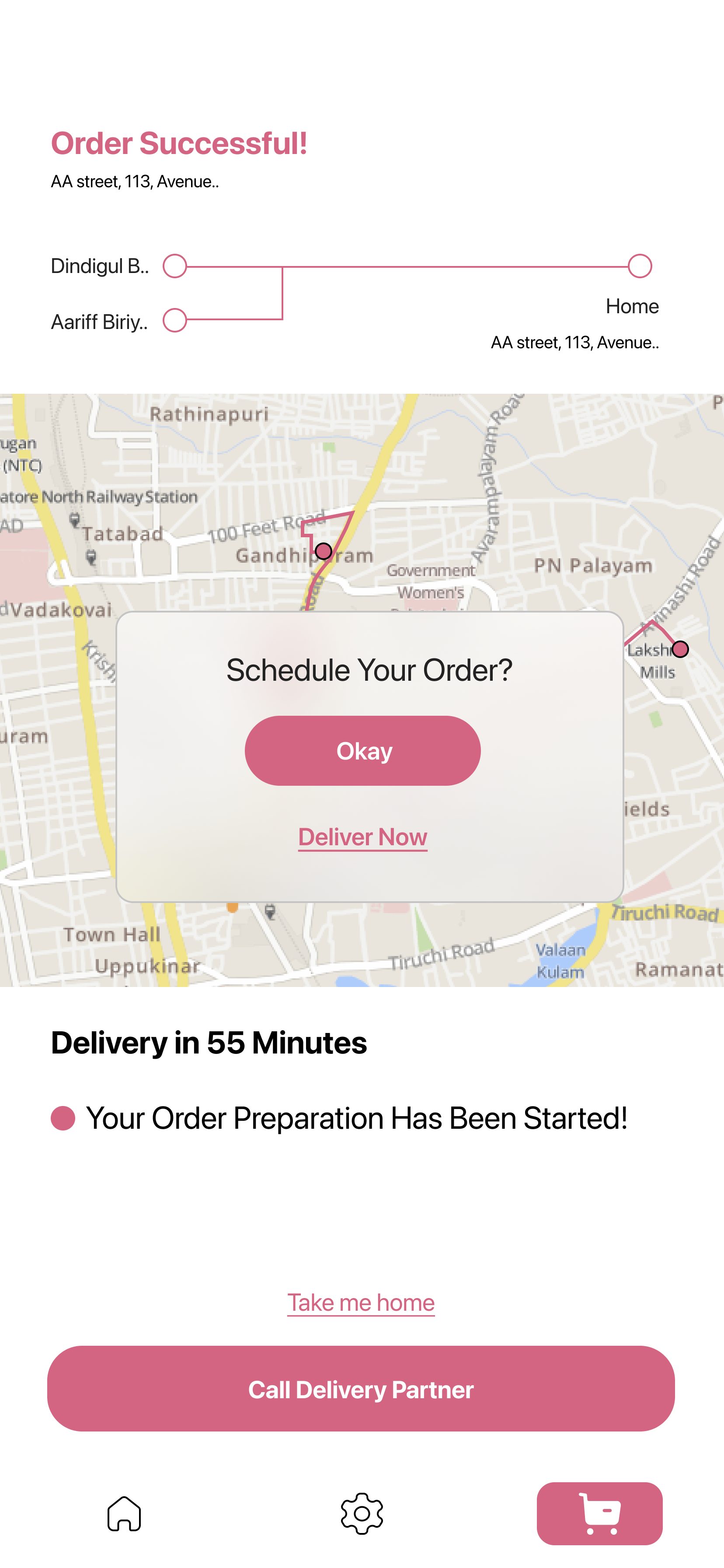
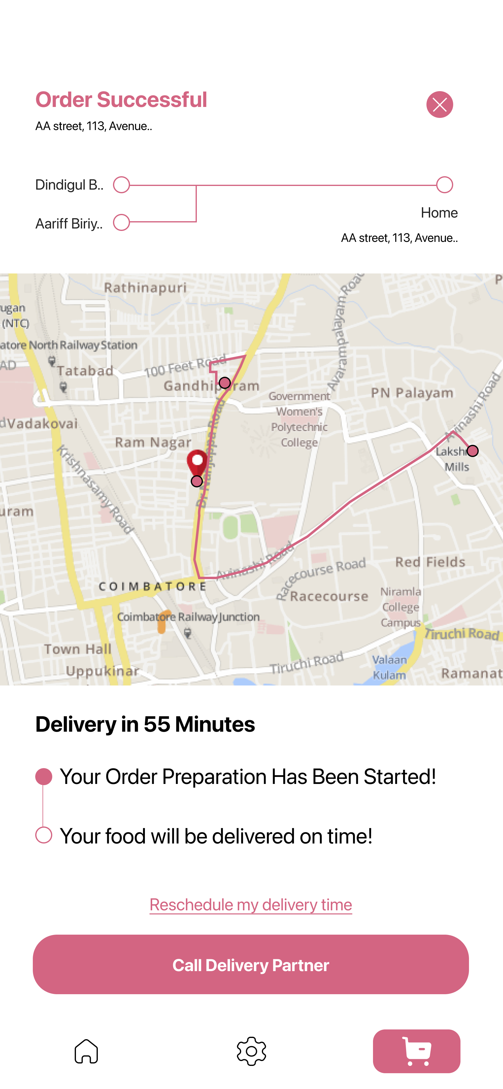
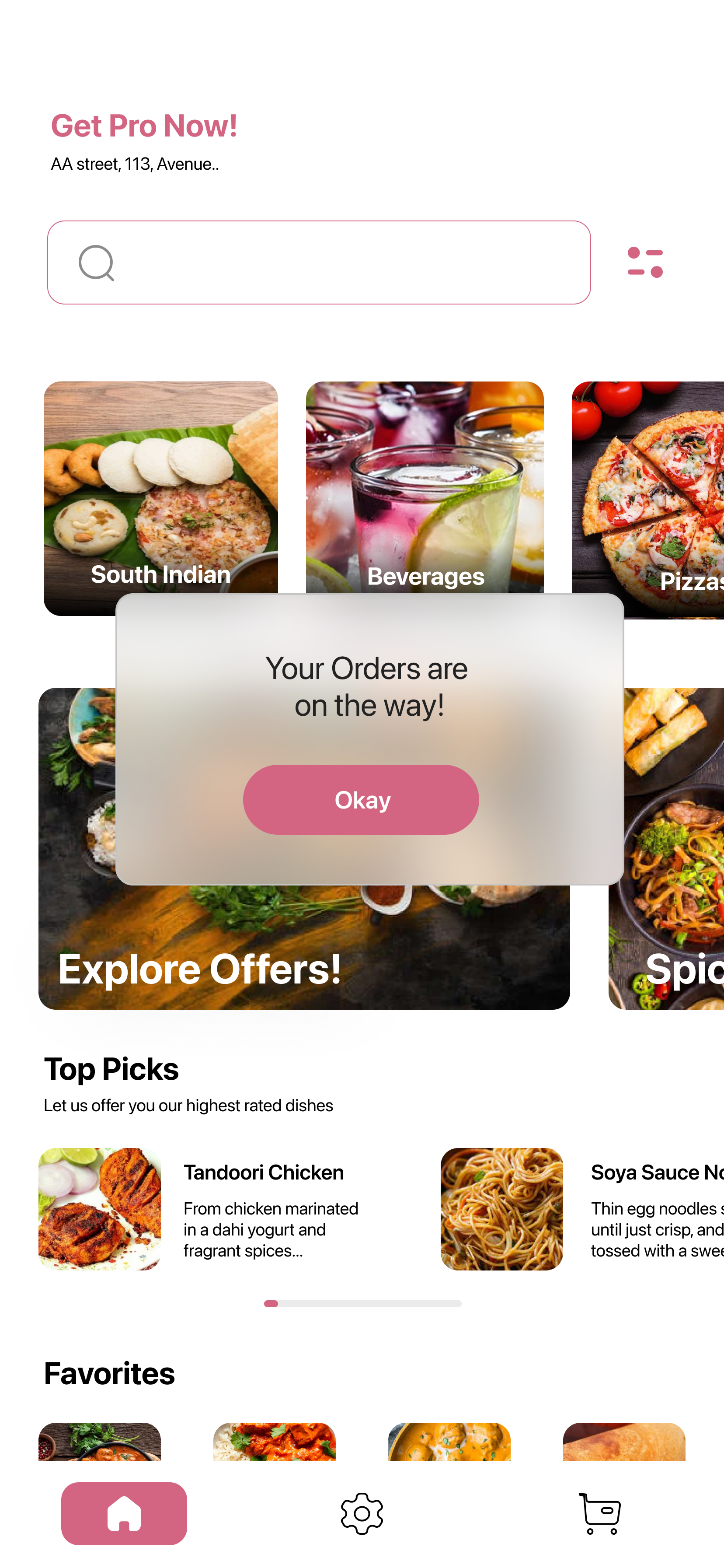
Other cart view screens
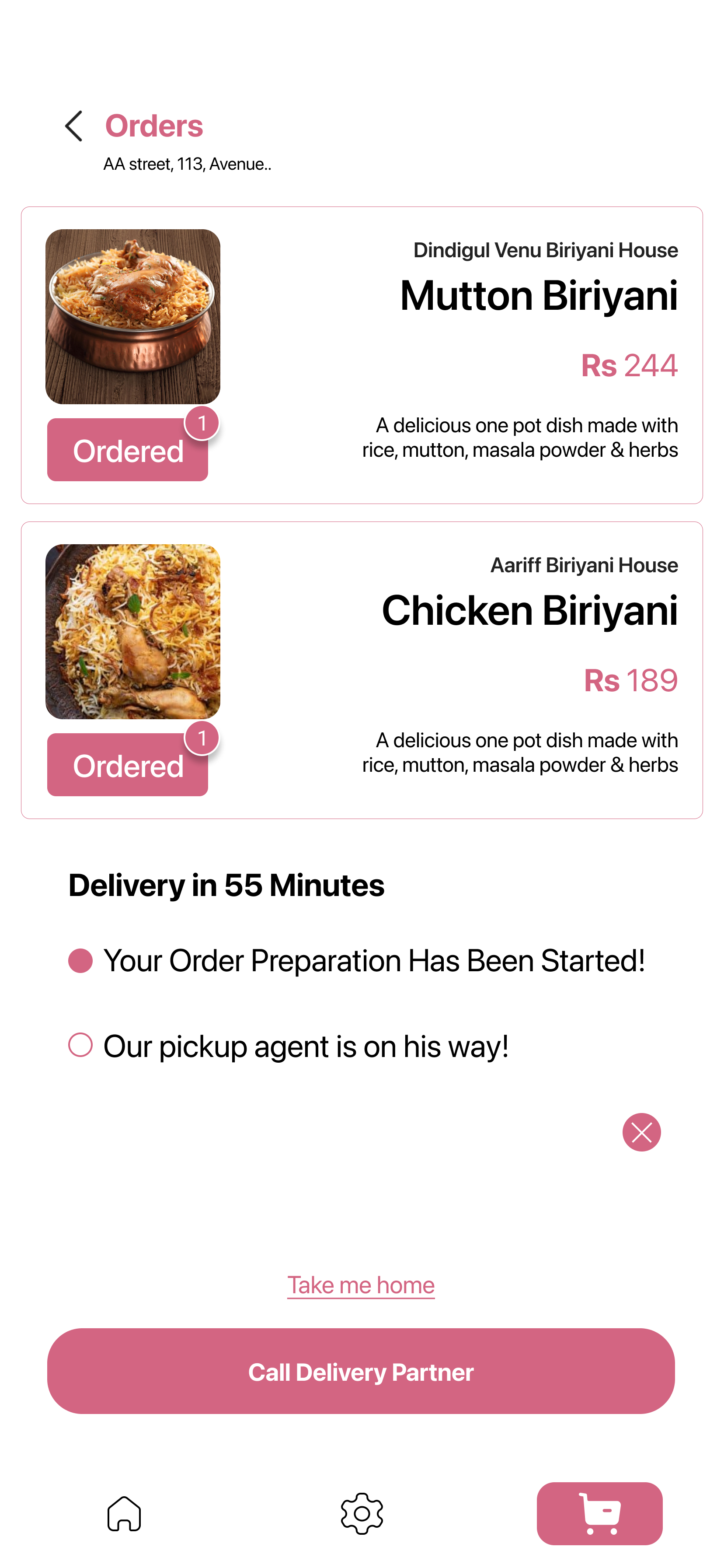
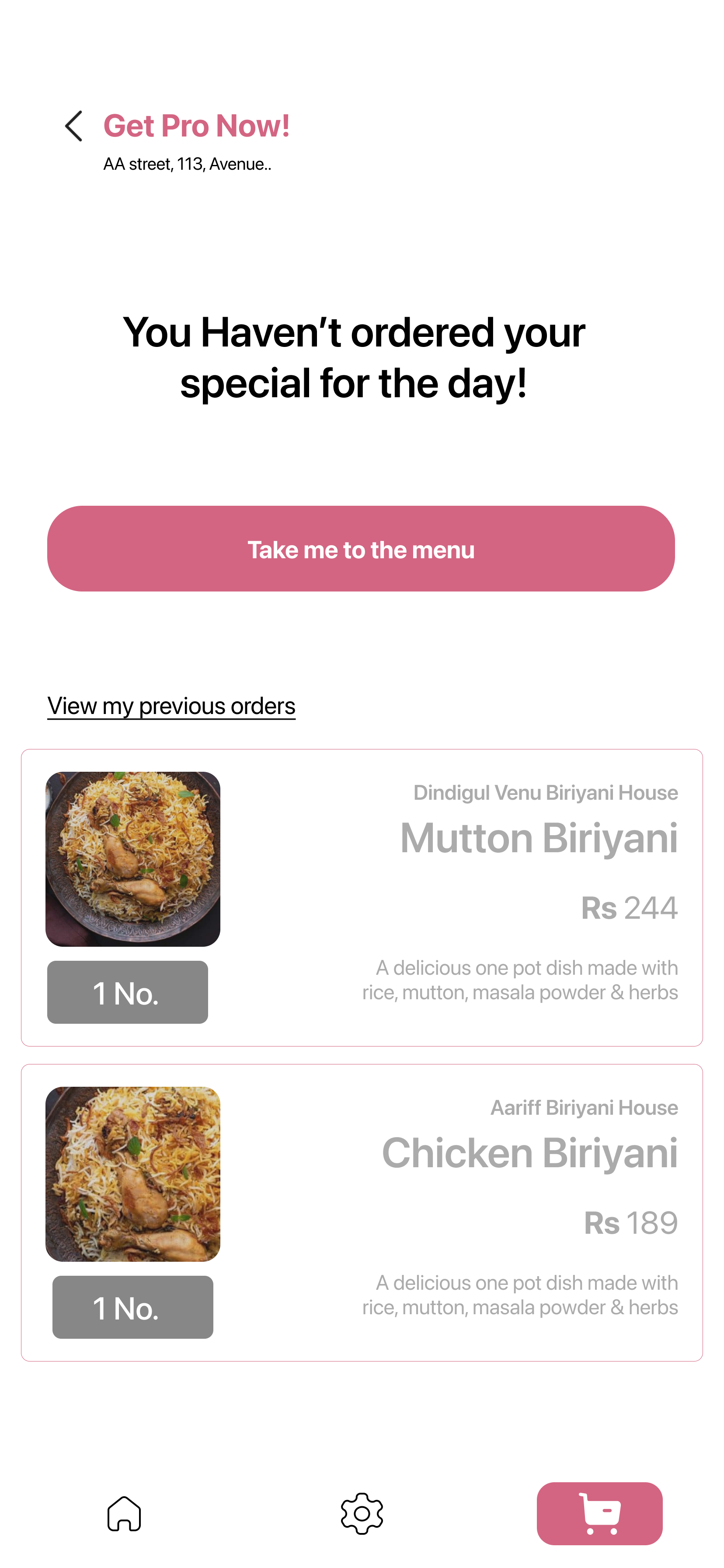
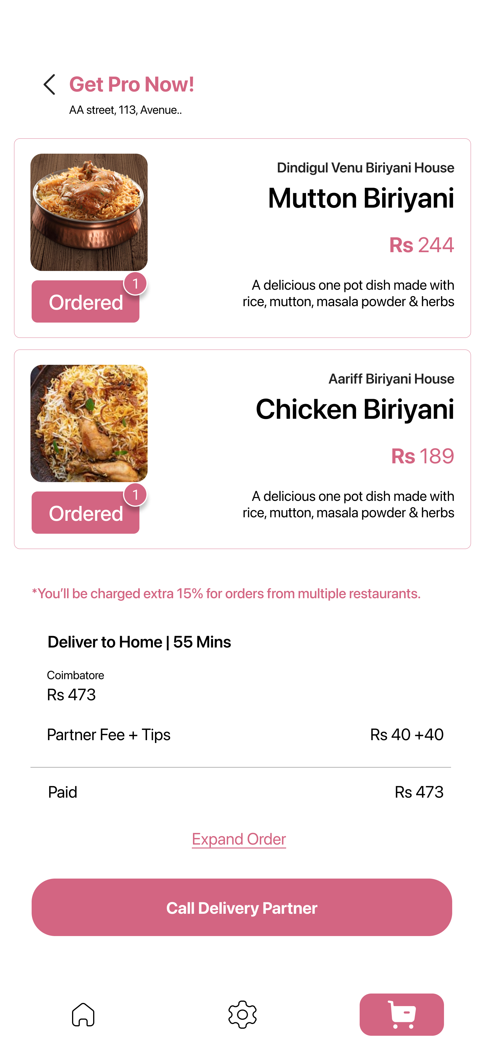
Early designs allowed for some customization, but after the usability studies, I added additional options to choose and add different food items together. I also revised the design so users can view all details in the same page with no hassle.
The second usability study revealed frustration home screen icon arangement and cart button. I reworked on the bottom navigation icons and fixed the distracting look of the search bar.
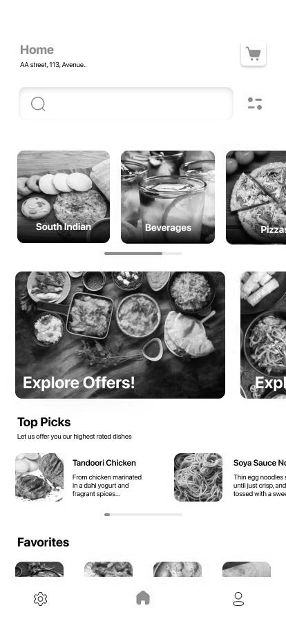
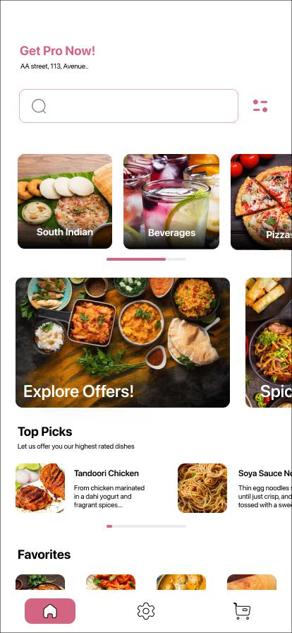
---> High-fidelity prototype <---
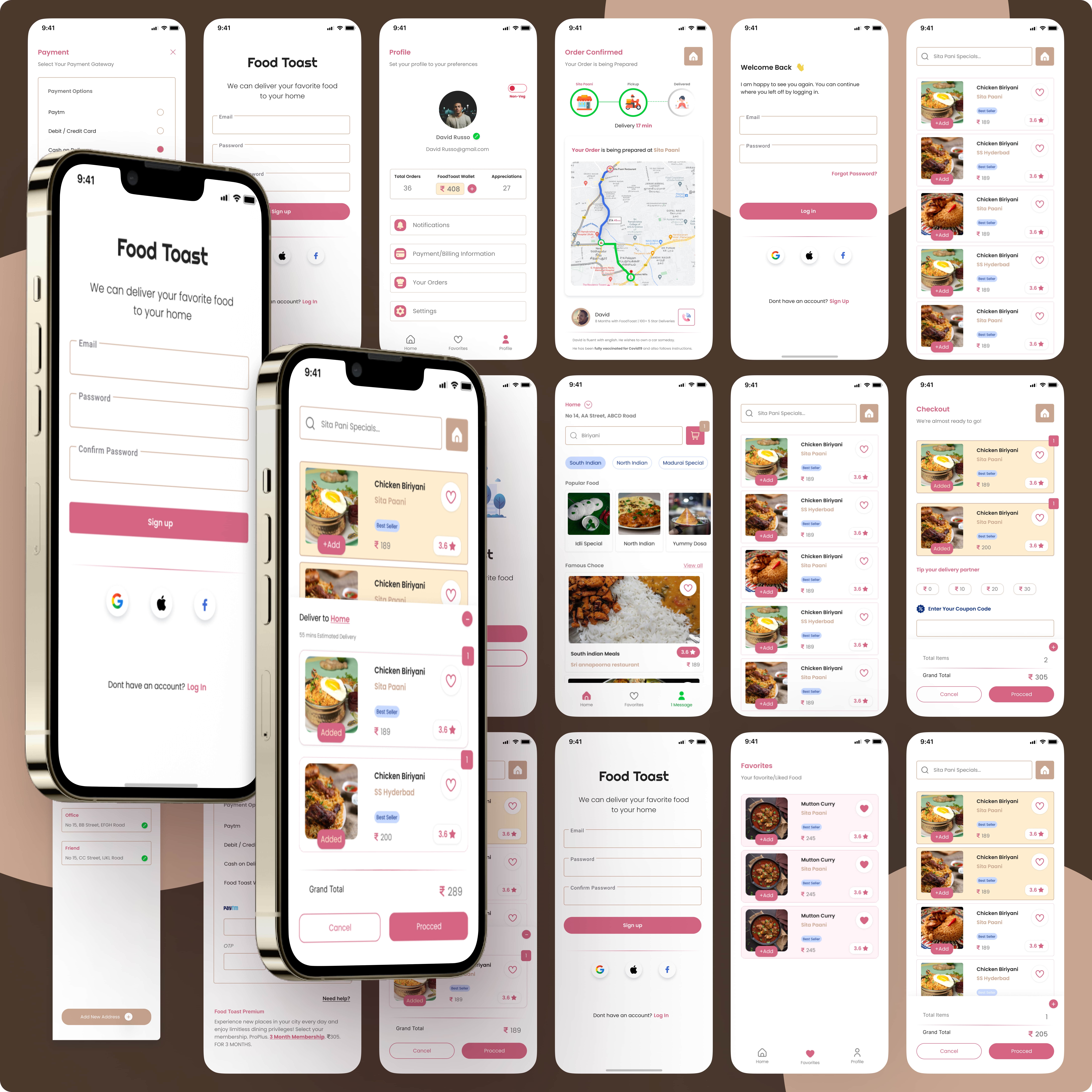
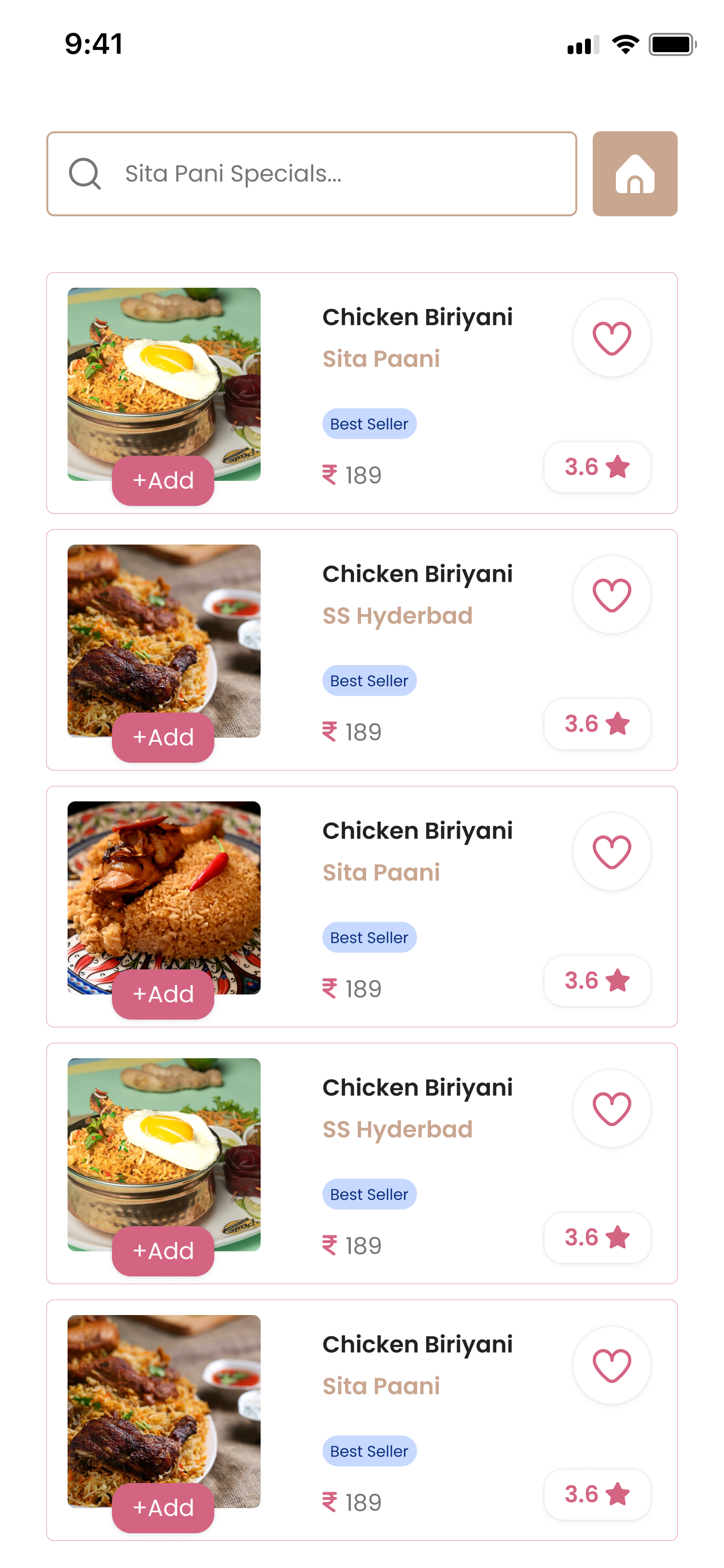
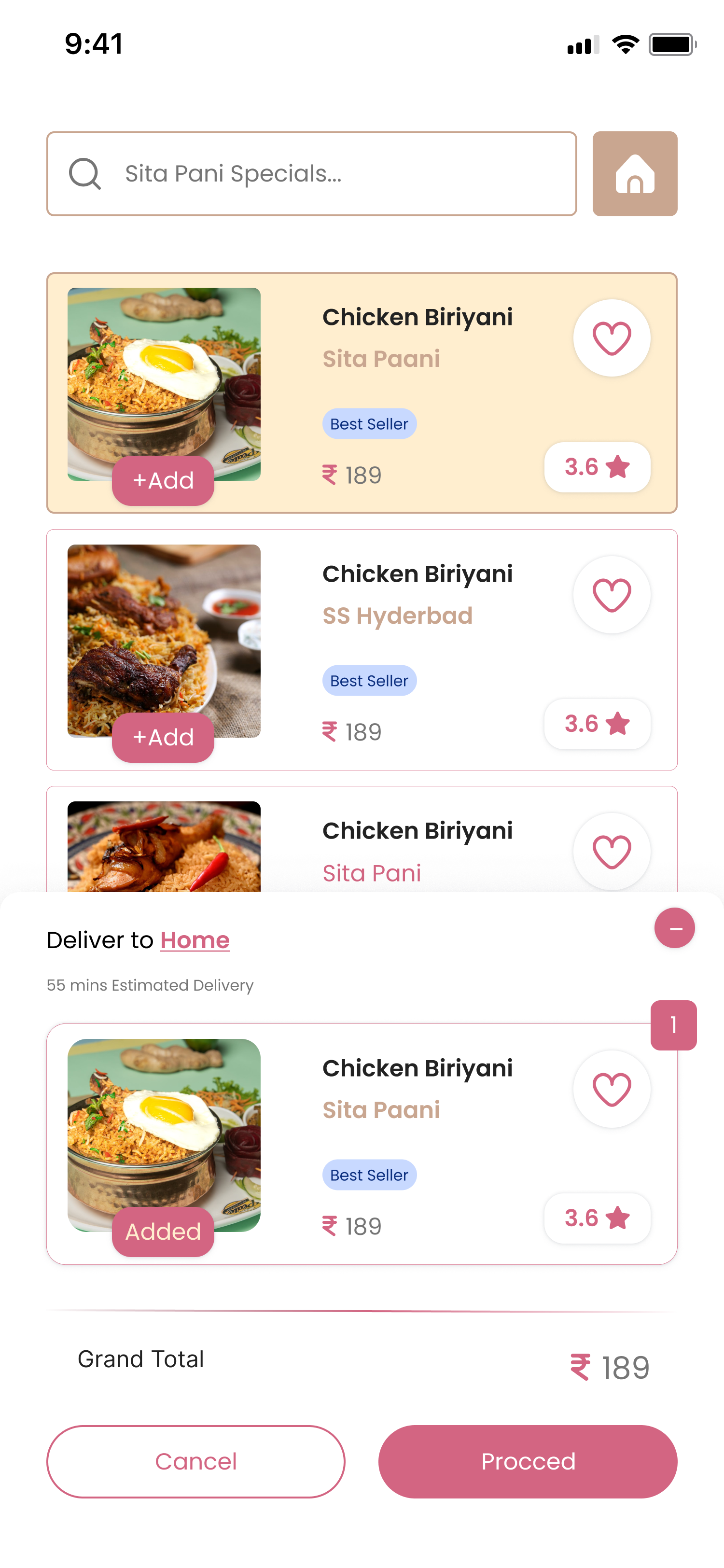
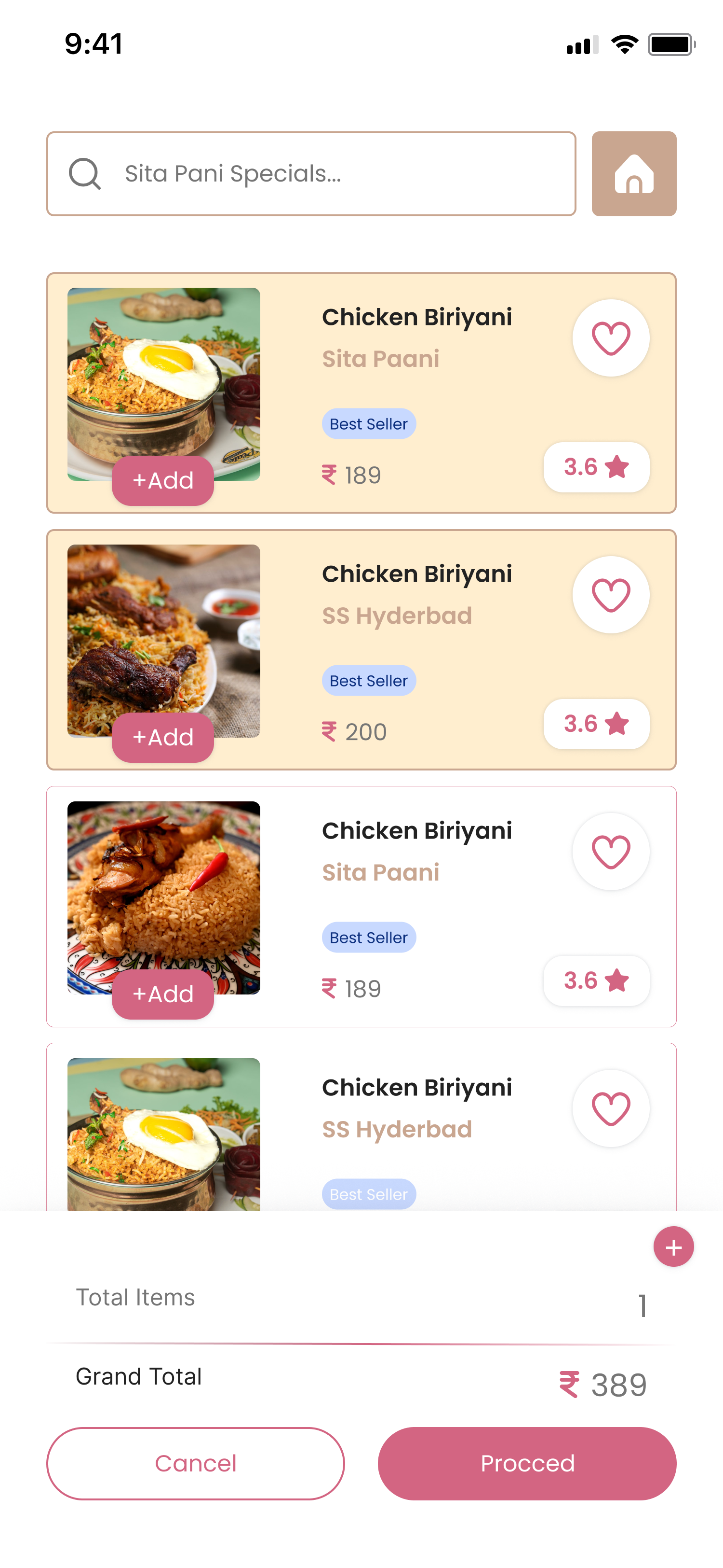
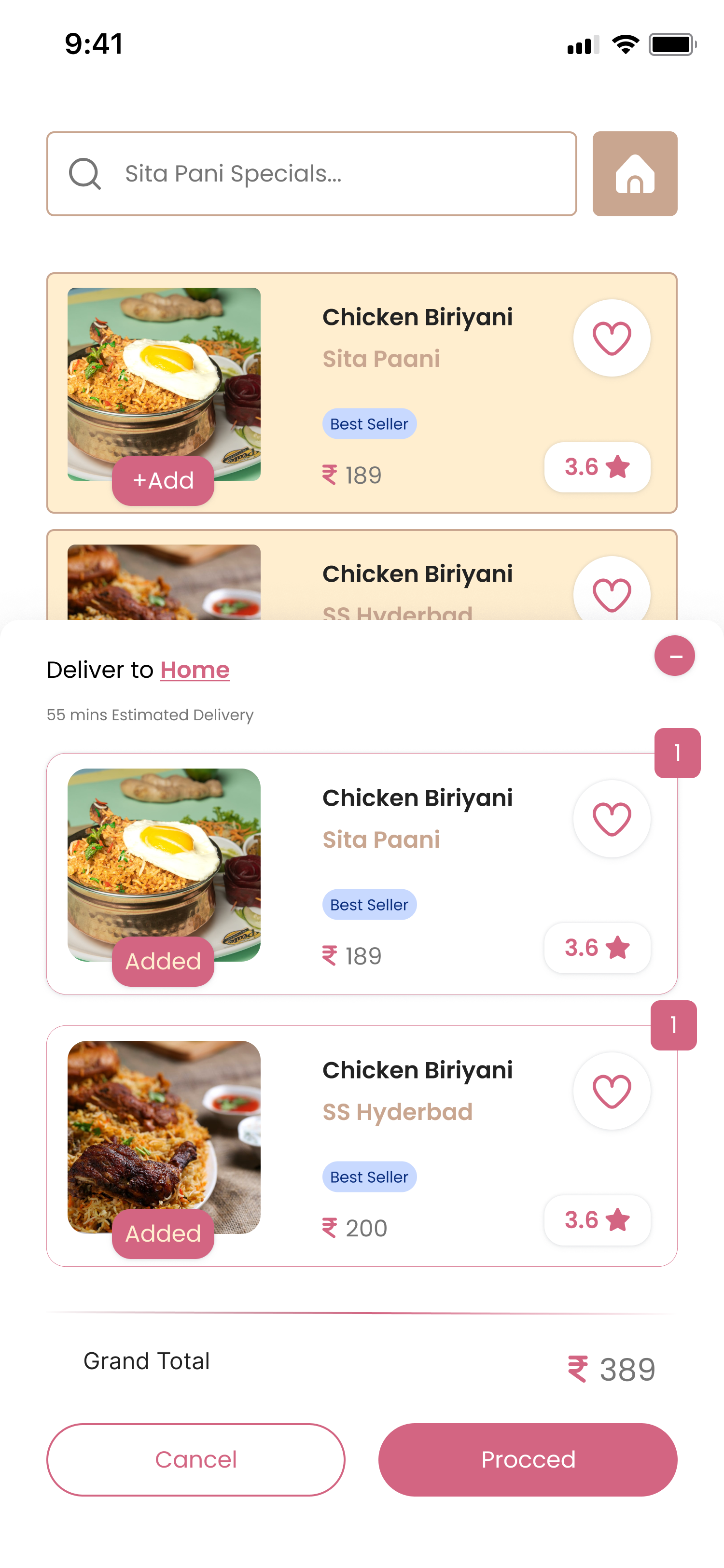
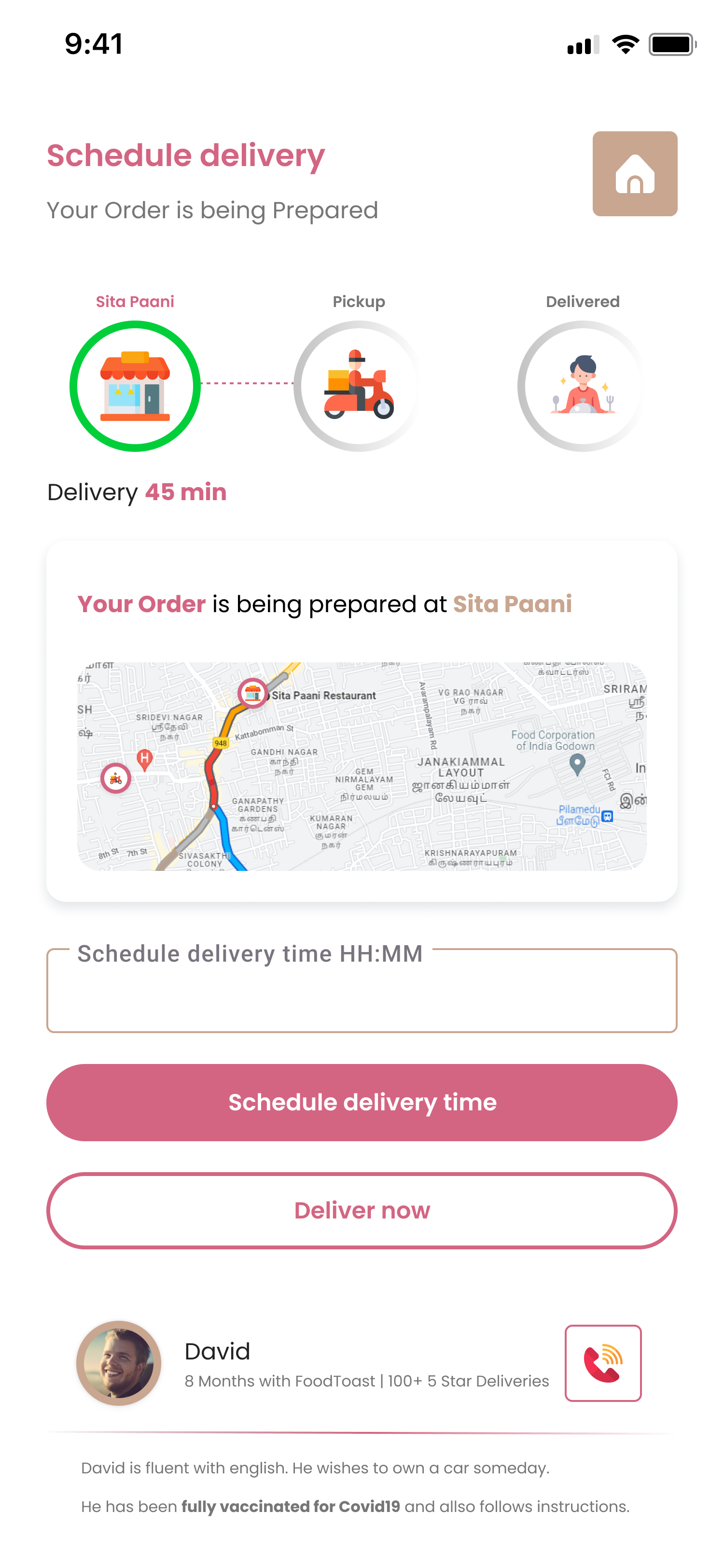
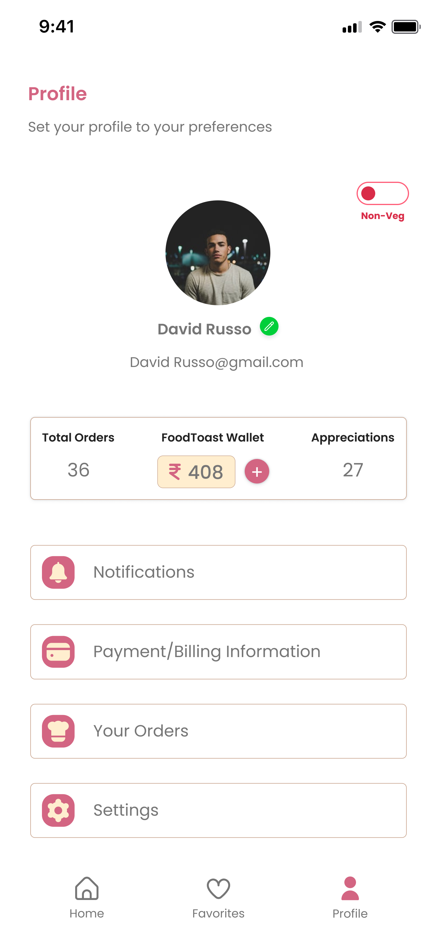
The final high-fidelity prototype offered simpler user flows for simultaneously ordering your favorite foods from many locations. It also satisfied users' requirements for planned delivery.
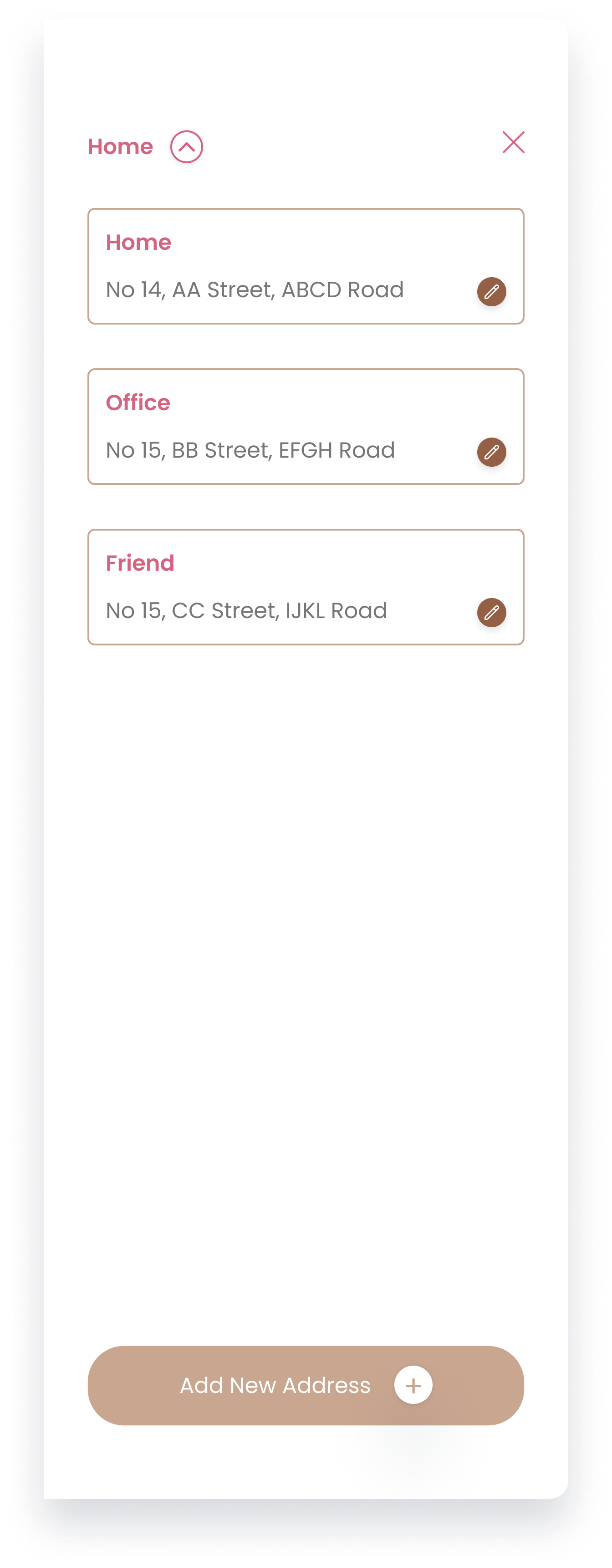
Final screens after iteration
Stage - 1
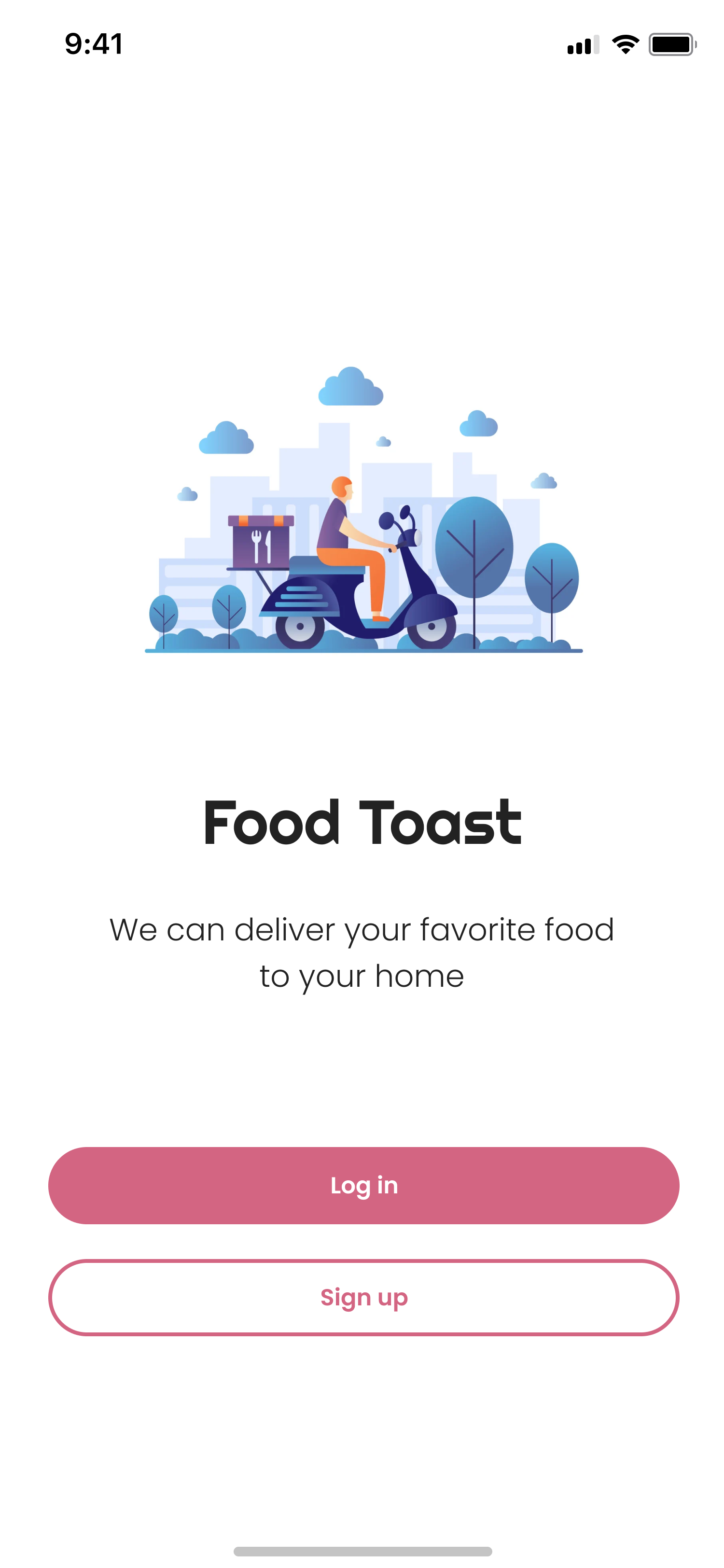
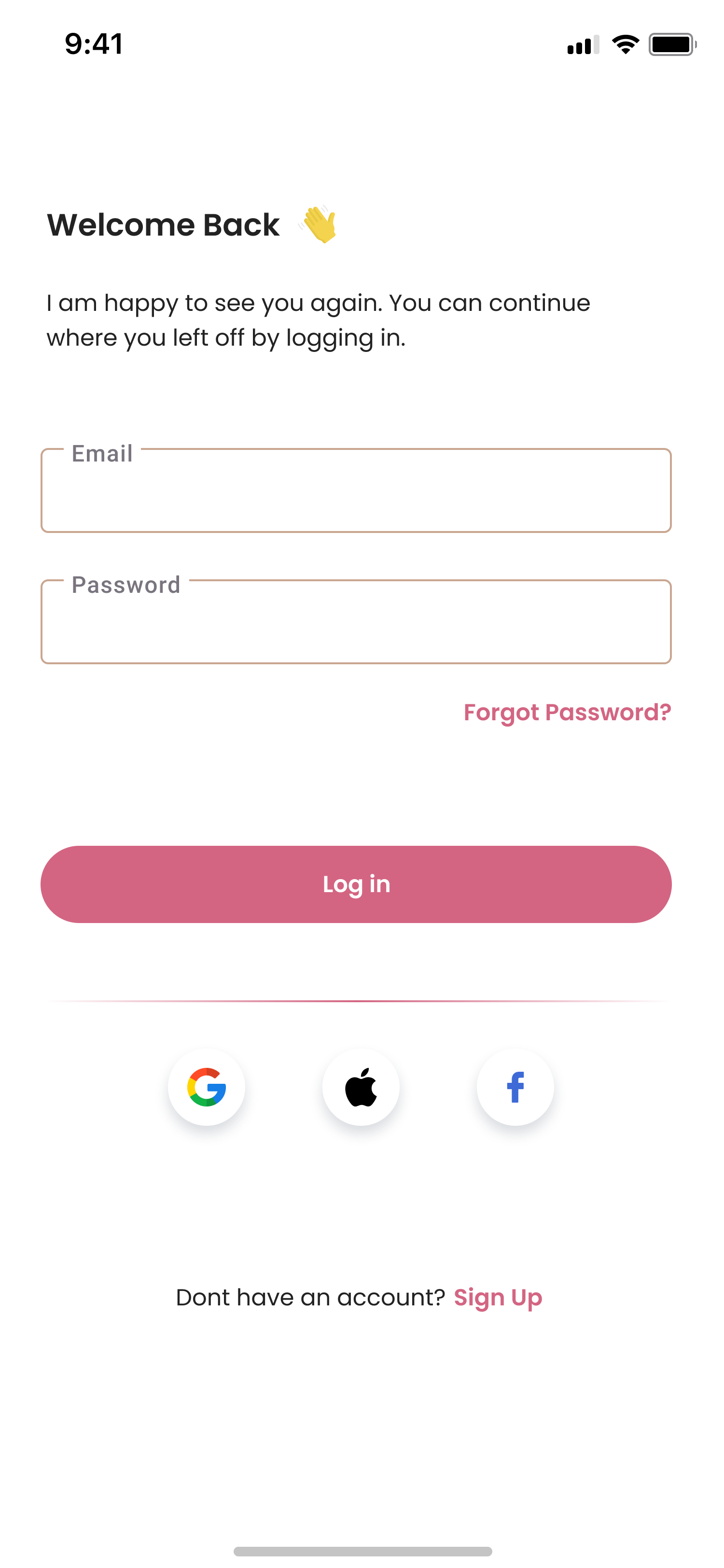
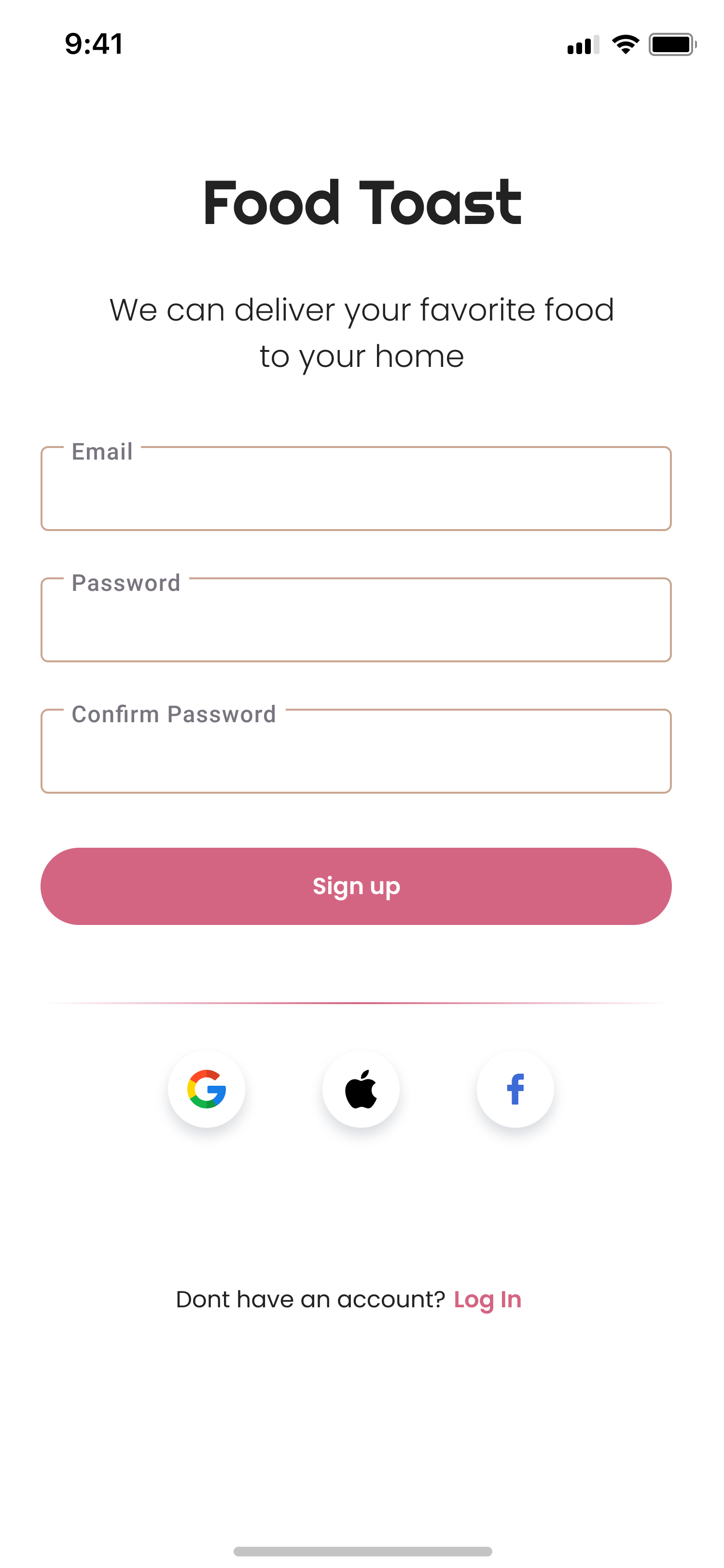

Stage - 2
Stage - 3
Stage - 4

Live prototype
Round 2 findings : Usability study findings
-
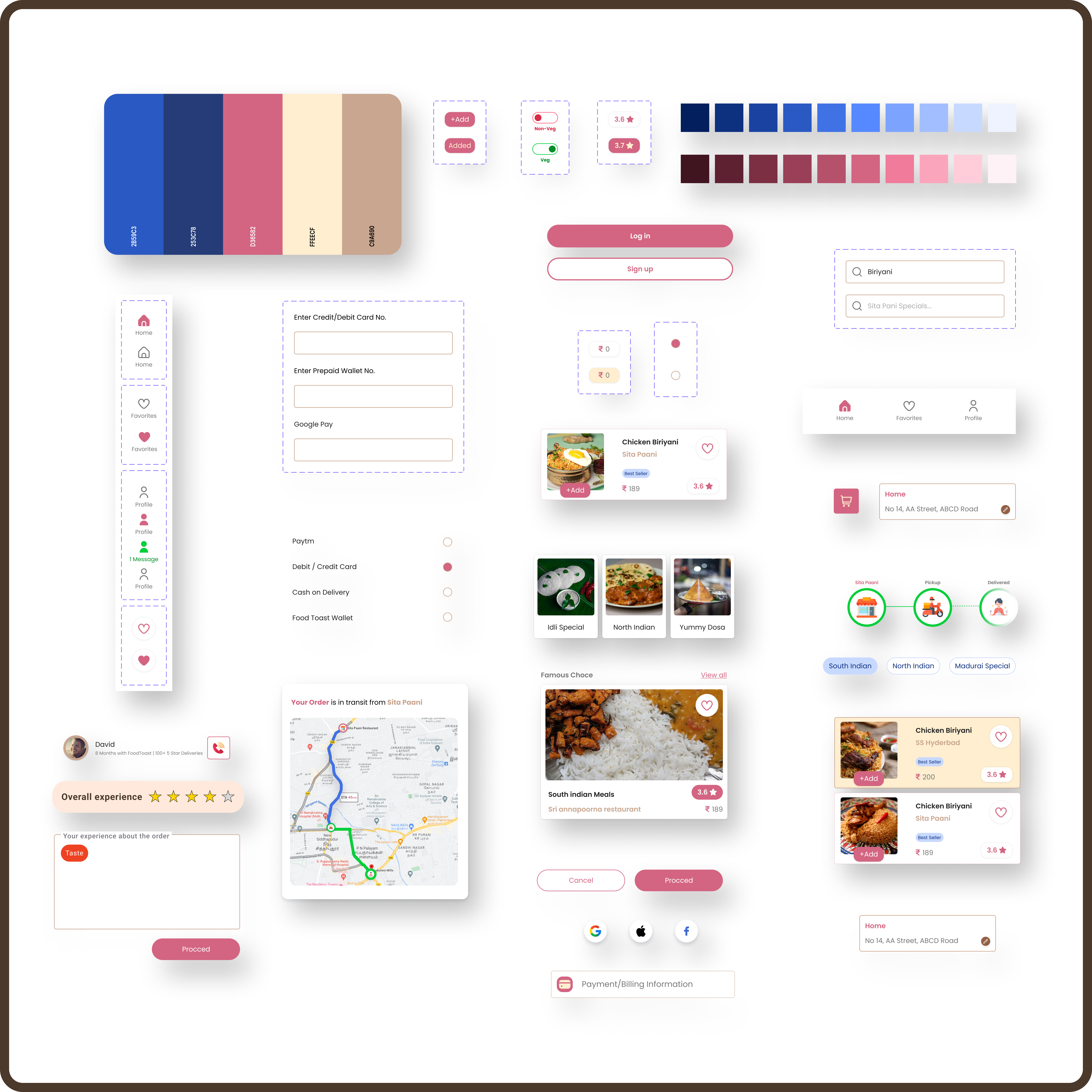
Enhancements to color contrast for accessibility
-
Time scheduling simplicity as well as induvidual screens that display order and delivery status information
-
Experiencce for signup and login have been improved.
Accessibility considerations
-
Utilized icons to make information retrieval and navigation simpler.
-
Used detailed images to facilitate understanding.
-
Experiencce for signup and login have been improved.
What I learned:
When creating the meal delivery app for Foodtoast, I realized that the first concepts were just the beginning of the process. Each iteration of the app's designs was influenced by usability tests and user reviews.
Next steps
To ensure that the usability issues raised by the users have been resolved, do additional usability testing.
To identify any new needs, conduct more user research.
Examine potential areas to integrate improvements for accessibility.